TEI MI: Smell— Workshop with Eggs, Vortex Cannons and Smell Guessing

Game time! The workshop started with the lecture which I discussed about in the previous entry, this entry will be dedicated to the playful part of the workshop. In addition to introducing the different playful games that involved scented media, Simon also had us experience some of these games (or a simulation of these games) first hand!

Encapsulation by 🥚EGG🥚

Playing with fragrant toys, a “scented bomb” created by an egg

To kick off the workshop, Simon handed everyone emptied eggs for us to fill with fragrant liquids. Every group could choose their preferred scent to pipette into the egg via a small hole that Simon has punctured. We selected to fill our scented bomb with rose water. To top it off, we sealed the hole with melted wax and when it dried up, the fragrance was now properly encapsulated! This is a demonstration of a method of encapsulation. The smell would be released when the egg is cracked, so it was up to us however we wanted to use the egg.

Related image
Egg fight!

We consider this egg as a toy, but this toy had no specific rules. The interpretation was ours.

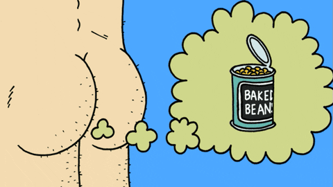
When we think of the form of an egg, its smooth surface and fragility immediately reminds people of the act of throwing, its ball shape affords a smooth throw, and the knowledge of how easy it cracks stirs up the childishness in every playful soul. 🥚🥚🥚

Image result for hot potato gif

What we had to do was ideate about the sensory impression that the egg provides. What are the affordances? After thinking within our group and observing others, it seemed to be that the egg affords being thrown, dropped, colored, and one group even boiled the egg. The group that boiled the egg managed to melt the wax, and the smell released was actually quite different compared to the groups that simply dropped the egg! Most groups ended up taking the eggs out to play catch, like throwing a hot potato, because the egg is so fragile, people were catching the eggs delicately, almost resembling touching something really hot.

My group took the egg out to play hot potato catch, Victor’s group did the same except they came out in full protective gear so the liquid doesn’t contaminate any shirts!

Ancient Japanese Smell game 🎌 👃

Kōdō is an art form that appreciates Japanese incense, in Japanese it’s written as 香道 and looking at the traditional Chinese characters, it directly translates into “the path of fragrance”. The activity of Kōdō is one of the three major classical arts that any woman of “refinement” in ancient (and maybe even modern yet traditional families) Japan are expected to learn. In addition to it being a ceremony of some sort, part of it contain game activities too.

The game activities part of Kōdō are called kumikō and genjikō, these activities involve incense-comparing games, which is what we were in touch with today.

When practicing kōdō, a mica plate is placed on top of smoldering coals and the incense or fragrant wood is placed on the plate. The fragrance is emitted in a subtle way, while the coal doesn’t actually burn the wood. In Japanese culture, Kōdō might seem to be all about testing your sense of smell, but according to them, participants “listen” to the incense instead. They believe that it’s the heart and spirit that connects to the scent, not just the nasal passage.

I really like the Japanese’ interpretation of “listening” to the incense and opening not the nasal paths but their heart and spirit. It’s a deep metaphorical way of describing how your smell chamber in the brain is closely related to your brain, or “heart and spirit”.

Simon and Daniel were the game leaders, they first dabbed three different essences of three different fragrance test strips, and have everyone smell all three in one particular order. Then for the second round, he swapped the order of the strips and our goal as game participants is to correctly identify the sequence.

Smell I I associated to mosquito repellent or mosquito repelling coils I used to smell a lot in outdoor seating areas for restaurants, and a general ambience of being home in the Summer (association with memory in action here!).

Smell II stirred up so many palettes up my nostrils, I quickly wrote down words I associated the smell to, without having a clear grasp of what it was. I wrote orange, fruity, floral, ginger, herbal, lemongrass. So many descriptions but all vastly different scents! This shows how anything can smell like anything!

Smell III reminded me of burnt wood, this scent I was the most unfamiliar with, I didn’t have any memories associated with it and all it reminded me of was the workshop when people laser cut MDF boards. I heard scattered conversation about how the scent reminded them of Christmas, and I could see how it would smell like Christmas trees or lit fireplaces.

Trying the game out ourselves!

My process of memorization was simply writing down what the scent reminded me of, since I assumed that in the second round, the scents will remind me of the same things too. I found that by matching the scents up with certain memories I had associated to the smell helped me recall the correct order in the second round.

Vortex Cannons 💨💨💨

Image result for vortex cannons gif

Toroidal vortices is another delivery method of smell what allows for more targeting and control by the user. Smoke is first pumped into a hollow cannon via a smoke machine, and essential oils are then dropped into the cannon. The smell is then delivered (depending on the formation of your cannon) by pulling and releasing the mask at the other end of the cannon, almost like releasing an arrow in archery.

Every group got the opportunity to collect a canon each to play with the smoke and scent, Simon also recommended us to ideate about games that could incorporate these air cannons and this smell delivery method

Play time

After playing with the cannons a little and ending up feeling a little suffocated due to the multiple scents being delivered and polluting the little space we had, we moved to the next room just to discuss about what potential we see in games with this sort of delivery method.

Fart GIF
Farts in popular media and cartoons are usually portrayed by a green color

The vortex cannon is considered to be an efficient way of smell delivery because of its ability to target— the smell doesn’t dissipate as easily unless too many cannons are being used at once. In addition to that, I appreciate this delivery method because you also receive “visual” feedback of the smell, as it combines with the smoke, you see the scent being delivered across the room, and that’s interesting because scent tends to be naked to the eye.

Image result for whack a mole gif

We did a little bit of ideation, I think Weronika had the idea of paintball with scents instead, so whoever gets blasted with smell is out. I thought about creating a twist on the game Whack a mole, where each hole is actually a smoke cannon and you have to match scent to color of hammers— let’s say we have four color-coded hammers. An interesting concept would be introducing the blind-fold like the Marco-Polo example Simon provided during class, trusting olfactory senses and not just vision.

Final Brief

We thought the vortex cannon was our final brief for the project, but turned out we misinterpreted it during the presentation but the final brief was revealed as soon as we returned to our smoke-filled room.

The brief is as follows:

  • Modify an existing game and add a smell dimension
  • Produce: a brief (5 slide) Powerpoint in which you document your design process
  • Be able to: explain your game, including any rules, special equipment, narrative etc.
  • Briefly demo the gameplay characteristics of your game

Ideation (?)

After seminar, we all went home directly, none deciding to stay due to personal issues such as sickness and extracurricular obligations. We had a scattered conversation about how we thought this brief was simple and wouldn’t take too much time, which in hindsight might have been why we ended up having really sparse time at the end of the week, maybe we should’ve started working on this day.

TEI MI: Smell— Understanding potentials for Smell enabled technology in IxD / Smell enhanced Digital games! (literature)

Discussion of two texts:

Text 1— Beyond Smell-O-Vision: Possibilities for Smell-Based Digital Media

In the first text, researchers aim to question whether and how digital games can fruitfully incorporate smell-enabled technology. They implemented both qualitative and quantitative ways of analysis to support their thesis— a structured qualitative design work was aimed at identifying & clarifying basic problems of scent-based interaction and have allowed them to explore color, shape, and scent association. However, quantitative methods have also been utilized to collect results from their tests, such as the memory game where they logged which scents were guessed correctly and paired right.

Olfactory research was the research the authors carried out when investigating smell-based digital media. It is research regarding sense of smell. For example, this paper’s study is to find out whether incorporating smell technology in digital game applications can successfully facilitate enhancement of sensory and cognitive performance. According to the paper, olfactory research in the field of HCI has been directed towards exploring smell as an alternative modality for accomplishing tasks that can be performed by other senses i.e olfactory notification. The purpose of olfactory research is to focus on developing and evaluating smell-enhanced technology, look into its potential, etc.

Digital gaming was also a topic where the authors were extremely invested in, and how smell-enhanced technology can be implemented. Digital gaming as defined as the authors is a “voluntary engagement in intrinsically rewarding problem-solving activities by means of digital devices such as computers, video game consoles, tablet computers or smartphones.” Smell can serve as an immediate feedback on performance as well as serve as a reward mechanism associated with behavioral improvement.

Two studies were conducted using computer-based perceptual and cognitive olfactory tasks: 

  1. Correctly estimating intensity of odor components in coffee and tea— by 10 “healthy” adults
  2. Memory experiment on 14 “healthy” adult participants in 10 lab sessions over three weeks. Pressing white squares triggering ⅛ smells from olfactometer

The results demonstrate that “smell training through learning games holds promise as a means of improving cognitive function”, olfaction suggested challenges but our olfactory capabilities may also create novel opportunities for learning and entertainment.

Text 2— Skin Games: Fragrant Play, Scented Media and the Stench of Digital Games

The second paper was mainly a discussion about different pre-existing game and play forms that incorporate scented media, this was also mostly addressed in the lecture the next day, so I’ll mostly be discussing about the workshop lecture below:

Simon reiterates, based on his second paper Skin Games, how smell has been incorporated in games that exist currently, as well as evaluates its presence, purpose, and the general performance as well as the scented media’s contribution to the flow of the game.

So what exists? What’s been said?

  • There’s no common digital platform for synthesis and distribution (mentioned above)
  • Smells can actually be integrated in various ways
  • Fragrant toys exist
  • Board games that use fragrant materials exist (will mention later), as well as game with smell themes and scent modes
  • Scratch n’ Sniff can accompany digital or analogue games
  • Games in real space can incorporate smell “ambience”, think an escape room
  • Smell design discourses with game-like qualities (perfume, Japanese Kodo ceremony)
Stench of a crime scene (Kojima 1988)

I’ve mentioned the game that smells like blood, would be cool if it actually worked. Hideo Kojima wanted to bring realism to player’s computer with more than graphic and storytelling. He wanted to use the odor of blood to inflict more emotions.

Another example that stood out to me was Takako Saito’s Spice Chess, this is a physical game that engages smell, which demonstrates how physical game can also incorporate scented media. It is a wooden chessboard with 32 wood and cork pieces containing various spices. Her vision was to rework the traditional game of chess by adding a novel, non-visual perception— the olfactory sense, tactility, and ambience, in order to follow chess rules.

Simon introduced other board games that include scented media, components, scratch n’ sniff cards such as Sentosphère, Leisure Suit Larry— Love for Sale, Guatemala Café, etcetera.

Final thoughts: Scent technologies for digitally mediated smell games are not needed, what designers for scented media should instead think about the stock of different available smells, as well as a digital form through which to play.

Finally, scent shouldn’t be just incorporated because Why not?, it should be use sparingly and must be properly paired with themes that fit with that particular scent, because this can thus create better novel emotional experiences.

Question

Why do you think it’s so difficult to design something that incorporates the sense of smell? In the field of IxD?

After evaluating scent technology, it can be concluded that controlling space of smell interaction “needs to be very intimate and under the control of the user, and it’s not always easy to achieve that.

(From Lecture Powerpoint)

  • Unfamiliarity, not what designers are usually geared towards when designing around senses (generally focus on perception, feel, sound)
  • There is no universal system for classifying and specifying smells
  • Significant individual variation in smell perception and preference (very subjective, i.e one can think a specific scent of perfume smells floral and nice but the scent can remind another of the smell of their grandmother’s closet.)
    • Substantial impact of cultural and learned influences can place substantial impact on how one interprets smell
  • No universal system for classifying odors
  • 350 different olfactory receptors (so many!) in the nasal epithelium, versus 4 kinds of photoreceptors in the retina (sight) or 5 different taste receptors on the tongue (taste)
  • Psychological challenge: People have the beliefs about odors eliciting positive or negative health effects, so it’s important to consider carefully which odors to use and also be selective with the context in which they are presented

In the context of IxD

  • Lack of common platforms for integrating smell into computing settings 
  • No equivalent values for smell i.e RGB like for light & color 
  • Cannot create a great number of different scents from a limited number of primitives
  • Alternative sensory modality bc normally fulfilled by sight or hearing

References:

Niedenthal, S. (2012). Skin games: Fragrant play, scented media and the stench of digital games. Eludamos: Journal for Computer Game Culture; 16.

Olofsson, J. K., Niedenthal, S., Ehrndal, M., Zakrzewska, M., Wartel, A., & Larsson, M. (2017). Beyond smell-o-vision: Possibilities for smell-based digital media. Simulation & Gaming48(4), 455-479.

TEI MI: Smell— Kick-off!

This week’s theme is Smell. Led by Simon Niedenthal— we will be exploring the sense of smell and what it’s capable of in the field of Interaction Design, as well as be introduced to what “projects” on our olfactory system have already been researched and carried out.

Simon has abundant experience with researching about and generating smell-based interactive games and art.

Smell Lecture

What is the sense of smell? The sense of smell, or olfaction, is a chemical sense (like taste)— Which means that we’re responding to these molecules while they enter our body (Niedenthal 2019). A person’s sense of smell by driven by a molecule released from a substance which stimulates special nerve cells (olfactory cells) high up in the nose, the olfactory cells then send information to the brain where smell is identified.

In the field of interaction design, smell interaction is found to be more challenging to design because it’s more unfamiliar than the other senses of the human body. The process which olfactory information is coded in the brain is still being researched and not fully understood. When the information of the smell is sent to the brain, the brain puts pieces of the activation pattern back together to identify and perceive the smell (Leon & Johnson 2003).

Smell and Memory

Smell and memory are akin to each other. The sense of smell is closely linked with memory due to brain anatomy. The brain’s smell center— the olfactory bulb, is directly connected to the amygdala and hippocampus, which makes sense because smells often immediately trigger a detailed memory or intense emotion.

Those with full olfactory function may be able to think of smells that evoke particular memories (Psychology and Smell). For example, on Wednesday when we played Smell games with Simon where we had to memorize then recall smells that shown to us, I quickly associated the first smell (which I don’t remember anymore what the smell ended up actually being) to mosquito repelling coils as it strongly triggered memories of being in my grandparents’ backyard in summer back in Taiwan.

Smell is disposable?

There is a “negative cultural attitude” towards smell, as many prefer losing smell than other senses of the body—

Nobody perceives it as “Wow, my life will be so much better when I can smell my email.” . . . I think the general perception of the world is “Gee, it would be nice to have, but if it never happens in my lifetime I won’t be any the worse for it.(Scott Summit, product designer for DigiScents iSmell computer peripheral)

Which I agree, I mean, I would rather lose my sense of smell than being able to see or hear. But I remember last winter when I got sinusitis I lost my sense of smell due to a clogged sinus and what came with it was loosing my sense of taste as well. I could perceive the four main primary sensations of taste— sweet, salty, sour, and spicy, but I couldn’t taste all the other nuances, which basically resulted me in feeling all kinds of unsatisfied when it came to eating, not to mention the discomfort of not being able to smell. That being said, I do agree that it’s not necessarily the most vital sense of the human body but it definitely causes great discomfort.

Smell in Interaction Design

When we think if smell in Interaction design, we think of chemicals that can be used to present olfactory stimuli. So for example, in the case of a visual feedback, it would then be substituted with an olfactory stimuli. Let’s think of smells in physical objects, and how it has been implemented in the past. Scented paper for Christmas cards and also an example that Simon brought up— A crime game disk that releases the stench of crime scenes when coming in contact with the heat of the computer.

Smells can be carried out via user activity, airflow such as fans, vortex rings, tubes, and proper encapsulation (Scratch n’ Sniff). But what’s been done on the digital platform is mainly encapsulation (crime scene disk example) using Scratch n’ Sniff, there is a lack of common platforms for integrating smell into computing settings, hence why it’s been quite a challenge to find novel ways of incorporating scent. There’s also been high profile failures in the history of scent technologies, which is probably why this field of research is not as motivated as other forms of stimulus.

In addition to that, there are other issues with incorporating scent—

  • Slow, persistent, and difficult to contain (spreads everywhere, like spraying perfume)
  • Act of obtaining scent materials is troublesome (perfumes, essential oils)
  • Miniaturization (big fans for airflow are difficult to make small and not bulky)
  • Aspect of contamination, leaves residue
  • Scent materials are depleted or exhausted over time and need to be replaced like ink cartridges

But ultimately smell has a tremendous potential for i.e VR applications— since it addresses our emotions so directly, it can greatly contribute to game experiences (or other interactive applications), making the experience more vivid and “tangible”.

References:

Leon, M., & Johnson, B. A., (2003). “Olfactory coding in the mammalian olfactory bulb”. Brain Res. Brain Res. Rev42 (1): 23–32. doi:10.1016/S0165-0173(03)00142-5

Psychology and Smell. (n.d.). Retrieved from http://www.fifthsense.org.uk/psychology-and-smell/.

TEI MI: Glanceability— Wrap-Up

On the final day, we quickly polished up our presentation slides in the order of — our concept, displaying our video, our methods, and finally explaining some design choices like our choices of UIs, hook-up method, as well as the color and usage of icons. Each member had decided what slides they would like to present in order to avoid disorganization during the presentation.

We thought by presenting the video first and getting straight to the point then explaining the methods we took and design choices we chose would help the audience quickly have a grasp of what our design concept  is. Not presenting chronogically can also prevent us from boring the audience.

✨ Works from the other groups ✨

I’m going to spare the long read and only write about other groups’ projects that intrigued me and that I (or us, as a team) could potentially learn from.

Aziza’s team really thought outside the box and created something “futuristic” and “sci-fi”-like, which really stood out amongst other groups because it felt like everyone was trying to be practical and aiming to solve issues that exist in the current world. I admire their boldness of selecting something so “unrealistic” and going with it, also their use of green screen was impeccable and I would love to learn how to do that.

Victor W.’s team had a really, really impressive paper prototype though their concept was a little complex to understand as they involved 5+ UIs. Good lesson learned, making something super complex doesn’t equal to a great concept. Their crazy prototype is something any UI designer can learn from though.

Zakiya’s team had a really informative video and using only paper for even illustrating the scenarios that the user will be involved in when using the glanceable UI, which was a novel way of setting the context that stood out from the other groups.

✨ Feedback for our group ✨

  • Zakiya asked why did selected the the hook-up method we chose— slapping the screens together.

We selected this form of pairing because we thought that was the most straightforward way of displaying the act of pairing on a video (and it also looked cool), there’s not much logic behind it other than the fact that we thought it would be the quickest and most convenient way of connection that didn’t require fingers and complex interactions.

  • Richard brought up that it should be automatic and smart watches and smart phones are often times automatically connected to each other, if the same app is open on both devices etc, so in reality there’s no need to do a “hook-up” action at all, we could just have it show up on the smart watch .

We didn’t really know how smart watches actually worked and didn’t really think that it could automatically pop up. We mostly chose to display the link this way because it was informative and looked good.

Yes, we could’ve just prototyped the wireframe of a smart phone and show how it can be automatically linked to the smart watch via bluetooth or via being under the same account login etc. Maybe we could’ve thought about making the interaction more realistic and think about the existing technologies smart watches afford?

  • David complimented us for doing some research and user testing, many other groups did not think about that step at all, even though it wasn’t a requirement for this project, it shows that we were really thorough with our idea. It’s true that everything can be done on just the watch (in a way, phones can be eliminated from this interaction completely and the ticket coupling can simply be done on the watch via a notification). Also, he thought the concept was interesting because it’s actually something already in development, Google is trying to design so that distractions are limited, no notifications pop-up when focusing on one task when needed (similar to the do not disturb mode on iOS).

✨ Reflections ✨

Image result for reflection vector gif

I’m participating in self-reflection here as I believe that this is the right space for me to process my thoughts and feelings. This has been a hectic week which has given us a glimpse of what’s to come. For this first part of module one, I believe that it’s important reflect on what did and did not work in our design process as each design process is a learning activity for future design processes.

This week’s assignment have not only helped us experience what a fast paced design space would behave like (both briefing and group dynamic learning) and also provided myself quick hands-on learning with XD (as I never got to use the software too much back in Digital prototyping). XD was a really important tool for this project as there’s no better tool for wiring an interface, and I thought it was a handy application for selecting colors and forming shapes and vectors all in once design space. That being said, in addition to learning all about the concept and importance of making an interface glanceable, it was also about experimenting with prototyping as well as giving time for testing which backs up our design choices.

Reading through Design Guidelines regarding Glanceability

I think reading the design guidelines regarding glanceability for watch faces provided by Google’s wearOS and Apple’s WatchOS to get inspired with how the information should be laid out on our interface as well as to get a glimpse of what’s already been done in the field regarding glanceability. Thanks to the design guidelines, we took our designs out for a spin, testing it by running because the Google design guidelines had recommended to shake the interface to test if the information is glanceable. But we also were aware thanks to the guidelines that choosing a round interface would limit our space for design which really guided us in placing our hierarchy of information in the most effective way possible.

Ideation

Ideation is arguably the most important phase in a design process. Though our ideation session took two days and ended up being quite extended and wearisome. For these quick assignments especially, it’s important to learn the skill of quick preparation so we could jump straight to execution without staying stagnant and ideating around the topic of glanceability for an extended amount of time. We noticed this issue by Thursday, even though we did manage to complete things in time— and presented pretty polished work, it felt like we could’ve divided the work each day better so we weren’t too overloaded by the end. For example, if we spent only one day ideating, maybe everyone in the group would’ve gotten and opportunity to prototype their own interfaces.

User-testing

User-testing happened to be one of the main procedures we underwent that stood out amongst other groups, we took the extra step to user test in order to identify the flaws we had in our first iteration of the design in order to perform modifications so our final iteration was more grounded in research and testing. I think it really ended up being a plus that we took this extra step despite being limited in time because we received valuable insights regarding color, intuition of the icons, placement of and proximity between text and numbers, etc.

General thoughts about group dynamics and what we can improve on as we proceed

This first week felt exhausting but the outcome was definitely worth it, I think we could do better with dividing up work and a lesson for myself personally is that I should stop being a perfectionist and start listening to other people and let people do work too? I did not have to make all those designs at home on my own, I could’ve waited to work on it with my peers but I felt like time was limited, hence why I placed pressure on myself to stay up late and experiment with the design layout. My group has some talented individuals so I should give everyone an equal chance of shining a little. I almost felt too selfish at some point and that’s not how one should feel in healthy group dynamic.

TEI MI: Glanceability— Designing a Multi-UI interaction for Navigation

At home prior to today (Thursday), I had done some brief wire framing, laying out designs just so we can quickly jump into user testing / modification of design and quickly end the day by filming and editing.

Josefine brought up and idea for user testing that is by getting users to reenact the real situation of running towards a train track in a rush with both hands occupied. She showed us Google WearOS design guideline, that is testing the interface by shaking, since people who wear watches are regularly in motion. We wanted to perform this test to see if our design is still usable at a glance during rapid movement.

It was difficult to find subjects since most groups were keen on focusing on their own since time was quite tight. In the end, we found Julija’s group and had Julija, Therese, and Victor try out our design.

We had all three of our subjects run on the hallway outside the IOIO lab, we asked them to first, close their eyes while we attach the watches, then put the bags in their hands, and finally, we walked to the end of the hallway and asked them to run towards us acting as if “in a hurry” and try glancing at the watch face without paying too much attention to it.

Victor performing our user test

After the runs, we asked a few questions regarding how the experience felt, how clear the information was displayed, if they knew what the icons represented and if the information was recallable.

Therese and Julija had a harder time recalling the information and understanding what the icons meant (mostly had trouble understanding what the train car icon meant), but Victor was quick to recall the information and knew what all the icons meant. Victor commutes every day from Lund to Malmö so maybe that’s why he’s familiar with these icons.

Other feedback we gathered:

  • Clock and departure time confused as one another? Is it the current time or is it the departure time, since it’s the only “time” displayed people think it’s the current time instead of departure time.
  • Icons too close to each other and too small, maybe divide them so it’s easier to differentiate
  • Color distracting, too “pink”
Post-test interrogation

After the user tests, we re-designed our wireframes, dividing the screen into two separate pages so the information on the screen are interchangeable. The first screen would display the departure time, underneath an additional time representing the countdown, and the track number. The second screen, changeable by a tap (we chose a tap because swiping takes more motion), displays the train car number and seat number.

Our information hierarchy follows what we believe is the order of what commuters check when catching a train, it goes—

Departure time -> Time left -> Track # -> Car # -> Seat #

This solves the issue with the icons and information between too small and too crammed, now that we’ve divided them up there’s more space to enlarge the information.

Regarding color, we simply removed the gradient effect and made the background one solid color, either black or white. The black design we’re using for our video and the white design we’re using for the wireframe. Black designs are more prevalent in current watch-faces. The white design is for the purpose of wire framing.

After settling on our designs, we went out and began our filming sessions. The black interface is the one attached to our watch, acting in our scenes. The white one we used in the end, using the inspiration from the Google Wear OS ad I’ve mentioned before, to create a GIF using a clear plastic board. This represented the “wire frame” deliverable of our project.

Our final designs, both a light interface and dark interface, added additional icons for departure and countdown to help user differentiate between the two and also not confuse the departure time as the current time.

There’s not much to say about the filming session, we essentially followed our storyboard created yesterday, making sure the interaction of our multiple UIs are clearly shown.

Concept—

Smart phone taps smart watch interface— Link successful screen is displayed

In the video, a subject hooks up the phone with the watch by tapping the two interfaces together, then the phone can be put away, as the subject runs towards the designated departure destination, they glance to check for the track number, car number and seat number.

For the music, we chose the piece In the Hall of the Mountain King from the Peer Gynt Suite, written by Edvard Greig and James Last, we thought this piece was suitable because it has a good build-up that creates a mood of suspension and nervousness, which was perfect for our mood of being in a hurry. Weronika used her music engineering skills to make the transitions seamless.

Here’s the final video—

Icons—

There’s no real reason why we chose the icons we did, we agreed as a group which icons are the clearest and most representative for the information we’re trying to convey. One can argue that having text is clearer but a watch face is tiny and the text would practically become unreadable.

We understand that icons might not be the best way to convey meaning / not as intuitive to comprehend as there’s symbolism involved which requires “training” to understand. Therefore, we discussed that this would be more suitable for commuters who are familiar with these types of symbols.

We also discussed after completing all the deliverables that red and green might not have been a good color choice for colorblind users, but we thought it was the most reasonable colors to use at least for the video.

This is the gif we created using the plastic board, it depicts the main interactions with the watch using wire frames, this gif ended up not being part of our video but as an additional visual for our final presentation

TEI MI: Glanceability— Ideation, discussing scenario and UIs

Tuesday

On Tuesday after the Seminar we got started with ideation! After reading through the examples provided, I proposed starting by discussing about devices and different interfaces first then maybe think around that, maybe. But I think ultimately we ended up by starting by envisioning specific scenarios and tasks and thinking around that instead, which I think was actually more efficient. Talking about scenarios, we quickly started leaning towards the gym as a context and discussed the different technologies used in a gym, and what we do in a gym.

We brought up scenarios such as

  • Checking your weight on the scale and linking that with your phone
  • Checking youtube tutorials of your favorite fitness guru and following along
  • Personal trainer and workout plans
  • Individual monitoring own workout routine, posture, reps, etc
  • Picking up phone calls on a treadmill, via the interface on the treadmill
  • Swapping music during a workout that’s intense with activity, incorporating a smartwatch?

Josefine brought up the concept of a smart gym which actually exists (how cool) and explained that basically people enter the gym and collect a smart watch (strictly gym classes guided by an instructor figure only), where individuals can monitor their own activity but the individual activity is also monitored onto a central screen where the instructors can also keep track of.

I thought this example is pretty intriguing and the concept of having someone monitor a body of people via a glanceable screen could be interesting to work with.

An example of a paper interaction, involving scrolling!

In addition to ideation we also talked about what we gathered from the presentation of David for our presentation on Friday— what deliverables are and the format of the presentation, etc. We realized that there are some questions we need answered so we’ll also leave that to tomorrow maybe taking it with David when he’s free. We know for a fact that, because he showed paper wire framing as a good example for video demonstration, we would do something in the photo studio where there are bright lights and white backgrounds. So Josefine booked a spot for us.

We didn’t stay in school for too long since the seminar finished rather late already and we each had extracurricular obligations. Proceeding tomorrow!


Wednesday

Today started a little chaotic and disorganized in my opinion, we all seemed a little out of the loop, hence, it was quite difficult to stay on track and get started .

We started with a scenario again, and at some point we set the mood or state of mind that we want to design for as— In a Hurry. With that as a guiding umbrella term, we each were given ten minutes and a stack of post-its to illustrate a five-step scenario, implementing a multi-UI interaction to solve a particular task. No settings or contexts were given so it was pretty open-ended and we could get as creative as we wanted.

My sketch for our five-step ideation activity

We settled with my idea for catching a train and knowing the exact location to go to for your departure, though Melika had a very similar idea for plane departures. We figured we could do the train station idea because it’s more accessible both for our limited time and our location— for filming!

We proceeded by adding more dimension and detail for our scenario, really pointing out everything that happens when solving the task of finding your train. It was difficult sometimes to fall off-track because we would go crazy with our ideas with for example, buying the ticket and showing the ticket to the train conductor, but that’s not the task we’re focused on solving.

The task is simply to be aware of the time of your departure, how much time is left to your departure, the track of your departure, and other information like the train car as well as seat. The interfaces we are designing for are the smart phone and the smart watch. We’re focusing on single trip tickets since we figured that those who have monthly tickets and commute on a daily basis probably don’t require navigation as much as travellers that travel rarer.

The general idea is having a ticket (displayed on smart phone) gather all the most relevant information and display that on the smart watch through some sort of coupling action. We selected the watch interface as our glanceable interface as we envisioned the scenario to be a commuter, in a hurry, with both hands occupied by luggage. And the easiest way is reading from a wearable device that doesn’t require complex interactions to perceive information.

The information we want displayed will be—

  • Time of departure (interchangeable with countdown timer?)
  • Track #
  • Car #
  • Seat #

We made the assumption of these being the most relevant based on personal experience, no interviews or qualitative research was done regarding that.

We wrapped up the day by doing quick sketches / wireframes individually then together as a group for what we want our interface’s layout to look like, such as how the hierarchy should be (in terms of which information should be predominantly displayed compared to others), a squared or round interface, icons or text, etc.

My sketches for interfaces from my notebook, tried both square and round interfaces. Also alternating what I think is the most relevant information— fluctuating between time and track #

We didn’t settle on our information hierarchy but we settled on the round interfaces— since traditionally, watches are mostly designed round. The round shape however, has its drawbacks, because it has 22% less UI space than rectangular displays and it also needs larger margins for text to be easily readable, according to Google’s WearOS design guidelines.

We watched the Apple and Google watch commercials to get inspired for how we want to structure / film our video, one concept stood out to us. That’s having the interface displayed in the center of the video screen but also have the interface be transparent so you can see the background as well.

Google WearOS video idea

End of day: Trying out green screen for paper wire framing idea, as part of ideation, not going to be incorporated in our final deliverables because the information hierarchy and the design has not been settled within the group yet. This idea (below) is making the time display interchangeable between the time of departure and the countdown to the departure.

During the day I also sketched out a quick storyboard for how we want our video laid out.

Though we didn’t have a smooth start today I feel like we got pretty far! We’ve started sketching our interfaces, we have a storyboard for our video layout, etc.

Tomorrow we’ll just be settling on our design of the watch-face, maybe doing some user tests, and finally filming our video!

TEI MI: Glanceability— Seminar 12 November

Today was the seminar! I had been quite nervous about this since base off of my memory of seminars they tend to be nerve-wrecking as you’re forced to speak spontaneously and I’m more of a planned speaker type of person. Prior to this our group copied all the questions onto a separate document where we jotted down some notes when reading individually at home. This form of note taking helps me highlight the most important information and also aids me in feeling more prepared for the seminar itself.

David started the seminar by emphasizing the the purpose of the seminar is to give us a quick overview of the topic, and see how we went by with the methods of the researchers that presented these papers. He was quick to note that he chose older papers (i.e 2006) before smartphones even showed up on the market to provide opportunities for us to see if we would “do differently” in the present, or at least come up with what we have observed to be different.

Other important knowledge I’ve gathered from the seminar— It’s important to debate over the validity of the paper and analyze the method of study to identify whether it’s reliable or not (i.e the second paper had a problem with not being so diverse with gender, and had an extremely limited target group of young males who have had experience with wearable fitness meters (fit-bits etc). David ensured us in saying that surely it may seem wrong but it’s fine to sometimes do only qualitative research on a specific few candidates that you believe you’re designing for, and it’s not necessarily about the quantity of people you’re investigating. Even one person could potentially point out a large-scale failure. However, when doing research, you really have to back up reason for choosing your specific target group.

Good lesson to learn— how many subjects you have doesn’t matter as much as who your subjects are.

TEI MI: Glanceability— Design Guidelines

Glanceability refers to the perception and interpretation of information after the user is paying attention to the interface

— Tara Matthews

[…] enables people to get the essence of the information with a quick visual glance

— Gouveia et al.

Week I— Glanceability Project kick-off!

The Brief of the week was revealed today, and it’s all about Glanceability. What does the glanceability of an interface mean? According to Matthews, a so-called “glanceable” peripheral display enables users to quickly and easily monitor updates in various tasks, which maintains flow and multitasking productivity, as well as monitors secondary tasks (Matthews 2006).

It’s coupled with perception and interpretation so we can simply interpret glanceability as the capability of making sense of / retaining information from a “glance”. It’s important because it can improve our ability to use a display “operationally”, task flow won’t be interrupted and it’ll be easier to switch in and out of tasks (and also give you the option to decide whether you want to switch, not interrupting).

When thinking about a glanceability, the most common interfaces / devices are arguably smart watches and smart glasses. They’re really good at summing up crucial information, their interfaces are small and wearable / always “there”, and doesn’t present complex information all at once (often times).

Let’s think of a scenario for example, if a notification pops up on your smart watch and it notifies you about an upcoming meeting, you can either ignore the information, wait for it to disappear from the screen, or address it by setting an alarm on your phone. It does not disrupt your flow because it gives you an option to continue whatever activity you’re participating in at that exact moment, but you’re also monitoring this introduced “secondary” task.

DESIGNING FOR A MULTI-SCREEN UI

Here comes the brief: Using our conception of glanceability based on what we’ve learned from the lecture as well as the literature, we must design through body-storming and paper prototypes the behavior of a multi-screen UI. We need to make wireframes to document the interaction of solving one task we’re solving.

We should make a video animation of the different interactions highlighting the interaction, where people touch the screens or buttons or any other interaction devices to depict how the whole setting looks like.

Here’s a video that demonstrates of paper prototypes in a video format:

I kicked myself off by reading about glanceability in design guidelines that David provided in the presentations for watch-faces produced by both Apple (watchOS) and Google (wearOS)—

Google’s Wear OS—

Wear OS by Google is a smart watch that “connects to the wearer’s body and provides the right information at the right time”. It’s a “lightweight platform that connects to the wearer’s body and provides the right information at the right time”.

Like I mentioned earlier, glanceable devices tend to be wearable, and this smartwatch does exactly that. Wear OS makes smartwatches into “glanceable standalone devices” so users can stay connected online and complete tasks quickly, while leaving their phones in their pockets, for example.

Regarding glanceability:

Google’s Wear OS is designed around being timely, glanceable, easy to tap, and time-saving. All of these contents point to the smart watch being a miniature and more easily accessible device that provides the most prioritized information at any time where it doesn’t necessarily “distract” you or interrupt your workflow.

On the website, Google Wear OS regards glanceability as keeping the several interfaces uncluttered and easy to read, and the information is organized using a clear information hierarchy. By doing so, the intended action is clearly shown and it’s much easier to identify the message provided.

Apple’s WatchOS—

The Apple Watch was designed to support lightweight interactions, facilitate a holistic sense of design, and manifest personal communication. According to Apple’s page dedicated to design themes, they emphasize how designing anything for their watch-face should require attention towards these three aspects, which are the foundations on which the watch itself was designed.

Regarding glanceability:

The apps in WatchOS are constructed to be actionable, responsive, and glanceable, which is what we’re looking at. According to their guidelines, making an app or device glanceable “makes the most important information readily available to the user”, like what Google’s guideline showed, both device are trying to readily convey the most significant information in a way that’s direct and easy to comprehend, without distraction.


It’s critical to consider what other people value as most important when designing different interfaces for different devices. From what I’ve gathered from David, only smart glasses and smart watches are referred to as glanceable devices. Therefore, it was relevant to read through the design themes and guides from both Google and Apple for their dedicated watch faces. I think we can start sketching some glanceable interfaces now, with these in mind!

References—

Gouveia, R., Pereira, F., Karapanos, E., Munson, S. A., & Hassenzahl, M. (2016, September). Exploring the design space of glanceable feedback for physical activity trackers. In Proceedings of the 2016 ACM International Joint Conference on Pervasive and Ubiquitous Computing (pp. 144-155). ACM.

Matthews, T. (2006, June). Designing and evaluating glanceable peripheral displays. In Proceedings of the 6th conference on Designing Interactive systems (pp. 343-345). ACM.

New course Kick-off: Tangible & Embodied Interaction

Kicking off our new course! For this course, unlike the previous course Interactivity which required more technical knowledge and more engagement with digital graphical interfaces, this course is allowing us to move beyond the GUI and towards experiencing— engaging our body and our capabilities for understanding and acting in the physical world.

We’re getting hands-on! I’m looking forward to having the opportunity throughout our several weekly mini projects to generate novel interaction technologies and methods which could potentially guide us in anticipating and understanding what we would want to explore and design effectively in the future!

Course moderators are David, Mali, and others.

The course will be structured as two blocks, the first block being four weeks of different projects, and each week consists of company talks and seminars. And the latter part of the course runs as a more major project with a new group where we will also get to pitch any ideas individually, which is nice as a preparation for an environment we will encounter in the future.

Final Essay: Movement in Design

Introduction

We use our physical bodies in our everyday life to maneuver, navigate, and communicate (Hansen & Morrison 2014). Many interactive systems, analogue or digital, involve the role of bodily movement as an embodied interaction. Dourish P once argued that the role of embodied interaction hinges on the relationship between action and meaning (Dourish 2001), which is extremely crucial for any form of design. Human cognition can be “performed” using moving bodies as an embodied nature. Therefore, we can argue that physical embodied interaction in the study of interaction design is often movement-based. All humans actions including cognition are embodied actions (Loke et al. 2007), that’s what makes it essential to the recent trend of movement design in interaction design.According to Loke & Anderson’s 2010 Study of Dancers, because “interactive technologies is movement-based”, it’s “continuing to become more embedded in our daily lives” and “our interactions with these technologies are becoming sought-after qualities” (Loke & Anderson, 2010, pp. 39). 

Drawing from pre-existing research on movement design as well as my personal experience with movement design in practice, this paper acts as an argumentative essay that proposes how movement can be articulated for the purposes of design, .

Defining Interaction

A major part of Interaction Design circulates around designing human interaction with digital products in addition to the study of how people interact with analogue products. When we look at the word interaction by and of itself, we can argue that it is associated to a situation or context where two or more objects or people communicate with each other or somehow “react” to one another (Cambridge Dictionary Online, 2008. Interaction, n.d.). Objects and objects can interact, human to human can also interact. But in the essence of interaction design, we focus on the interaction between people and objects. 

Let’s consider the word “react”. A “reaction” is a behaviour that can arguably be a form of interaction, that being said, reacting or “behaving” a certain way can be perceived as a movement in addition to a simple spark of thought in the head. What’s targeted here is an embodied movement. Researchers in Interaction design look at experiences felt and performed by users they’re designing for (Interaction Design Glossary), and a big part of experience involves the interaction between the user and a certain product. Targeting the moment of usage, some sort of movement is most certainly involved— some examples include the act of pulling down a projection screen involves the extension of the arm to reach the string and the tugging and contraction of the elbow to lock the screen in place, the act of entering an unmonitored 24/7 gym involves swiping your card then standing still for motion detectors to sense your presence and confirm that you’re not cheating the system by bringing in an extra person, etcetera. This can all be studied as a performance if we see the way we display ourselves as an act (Goffman 1959 & Hansen & Morrison 2014). We adjust our posture, our body language, and the scope of which we move our limbs to handle our weight and balance according to the context we’re involved in and what we are hoping to express (Hansen & Morrison 2014). 

The Technology of Identifying and Defining Movement

Movement-based interaction in design with technology is an emerging area that demands an improved focus on the human body and its capacity for movement (Loke et al. 2005). An abundance of researchers in design have contributed their perspectives on the relationships between embodied actions and technology design (Loke et al. 2007). People interact and move with, sometimes unwittingly, an increasing amount of technology— either with ones that involve directness and focus such as a computer or omnipresent technology that you inadvertently move through with such as the WiFi. This technology often influences how we move, or “react”. To study performance and movement, researchers have discovered and spawned many ways to explore this similar terrain and emerging field (Loke & Anderson 2010). For example, Loke et al. also used an established movement notation called Labanotation as a design tool for movement-based interaction using the human body as a direct input, this time using two different EyetoyTM interactive games (Loke et al., 2005). Loke and Anderson also utilized trained dancers’ moving bodies this time as an input into sensor technology to find ways of analyzing movement and discover useful consummations for the field of movement-based design and or interaction design (Loke & Anderson 2010). 

It is evident that movement design has been a crucial part of research in interaction design, and all the preexisting research done using some sort of a movement-based input that influences an output provides an invaluable groundwork for design of movement-based interaction. Loke & Anderson argues that this form of research can suggest “possible ways of describing, representing and experiencing movement for use in the design of video-based, motion-sensing technologies” (Loke & Anderson, 2010, pp. 39). 

Tracking and influencing of movement is becoming exponentially important as movement design is being investigated in a grander scale as part of interaction design. Designers today have access to movement data through sensors like our iPhone’s accelerometers and gyroscopes, or other gadgets such as the Kinenct. The truth however is that very few resources exist in interaction design to “meaningfully engage with full-body movement data (Hansen & Morrison 2014) compared to the resources provided for other studies in interaction design, as movement is often times abstracted and nuanced, and arguably also inconsistent. That is why the tracking and influencing of movement reveals its importance in this specific study. 

As students in the field of interaction design, we were granted the opportunity to dig further in the idea of finding ways to better articulate movement for the benefits of design by examining our everyday practice of movement. When discussing movement, we’re neglecting subtle movements such as swiping screens and pressing buttons, but performing an exploration of the entire body, hopefully finding potential for innovation of movement that can contribute to the exploration and creation of novel embodied interactions.

Movement design in Practice 

For Module III of the interactivity course, students were given the opportunity to explore machine learning code using movement as an input. Having worked with pre-trained models for visual recognition in Module II, this round involves the utilization of machine learning models and movement data registered from movement sensors in our smartphones with the goal of gathering knowledge of what machine learning is as well as to gather knowledge of the practicality and usability of machine learning as a material in design and exploring its usefulness in movement design or in the general scope of IxD, as well as in the broader context of AI. Ultimately, the aim is to explore new gestures for movement that can potentially take charge in the field of Interaction design. 

Getting inspired by Loke & Robertson (2010)’s notation for describing movement 

Though the project involves the handling of machine learning models and technology, the overall aim was to design interactive systems from explorations of movement as opposed to targeting the technologies and using it as a starting point (Loke & Anderson 2010). 

When we selected our specific gesture— the “YES!” gesture, which involves a swiping motion of an extended arm completed by the curling motion formed by the contraction of the elbow (see Figure 1), which was first taken out as an interesting gesture drawn from the action of pitching a baseball— we participated in first-hand exploration of the movement, we digitally recorded our gesture as performed in different contexts for transcription purposes, and later performed an in-depth analysis on our gesture inspired by Loke & Anderson’s notation for describing experiential qualities to fully grasp our selected movement (Loke & Anderson 2010).

Figure 1. “YES!” gesture in motion as illustrated by stick-figures.

Using videos as a way of referencing, as well as cropping frame by frame from our videos to have static images to reference to and to ease the process of jotting notes— we examined the process of pitching and in a later iteration: the “YES!” gesture. We performed analysis on our videos and static images using two unique perspectives—an experiential perspective, produced by first-person impressions of the gesture, think felt experience and bodily awareness, and an external, observational perspective that produced visual movement sequences (see Figure 2.). In other words, the mover and the observer perspective (Loke & Anderson 2010). This form of analysis granted us in generating a list of descriptions of the twisting body that we didn’t think we’d be able to come up with prior to this session of analysis. For example, “Hiding” and “Shielding” are descriptions we discovered to be synonymous with the “YES!” swipe, which was interesting because the “YES!” gesture is used to express extreme content and has obviously positive connotations. We believe this wouldn’t have been explored if we did not sit down and discuss the “felt” or “experiential” quality in detail after performing the action ourselves. 

Figure 2. Table of analysis for the dynamic unfolding of pitching (press to enlarge).

Challenges in movement— Vitality 

The vitality, or livelines and spirit, in our interaction with technology is a sought-after quality (Loke & Anderson 2010). However, it serves as one of the main challenges for movement design technologically. The computer has trouble sensing exuberance, or almost any other emotion, as all it sees are specific data points and coordinates that it has been pre-trained to recognize. As humans to other humans, we naturally experience people in terms of vitality as we can often predict and calculate their emotions based on the subtle nuances and authenticity  in their body language. However, that’s something the computer lacks to classify as movements are never “consistent”, “there is nothing rock solid in movement” (Hansen & Morrison 2014), people perform certain movements differently, with different expressions, dynamics, and nuances. 

We noticed this issue during our process as the machine learning code was rather inconsistent and erratic when it came to predicting the right gestures. Though both my partner and I were doing the gesture in what we think is the same way, the computer would predict the right gesture only when I performed it, since I was the one that recorded the gestures initially. In the first module even, was it obvious that machine learning may not be the most accurate in processing movement data. That being said, what became more crucial in this module three project was how we described the experiential quality of our movement, which proves to us that ultimately machines may not be the best at articulating movement, while linguistics can do a significantly better job. 

Conclusion—

How Movement can be Articulated for the purpose of Design 

Interaction design, as described as movement-based (Loke & Anderson 2010, Loke et al. 2007, Loke et al. 2005), raises new questions regarding the consequences and the influences the moving body can provide in HCI. I argue that movement plays an essential role in design because movement is often incorporated as an aspect of behaviour, and behaviour is closely investigated in part of user-experience design, because paying attention to this role of embodiment often articulates this association between action and meaning (Dourish 2001).  

In design, and perhaps even in fields involving computing,  movement is often and arguably best articulated through data. Data is important and relevant because it allows for informed decisions. It allows computer models to better understand movements and elect or fit an appropropriate responses. Data for movement is unique as it delineates both arithmetics as well as bodily awareness qualities. In design, data is vastly used to alleviate the stress in putting effort and required preciseness demanded on humans. Thanks to computer vision, artificial intelligence, and the fast-growing smart technologies, human-errors are greatly reduced. Computers do a great job at seeing what we can’t and is also quick at processing an abundance of importance within a blink in time. They take up these tasks that some humans can’t, or mitigates the task for us.

Throughout this module however, we have learned that data isn’t necessarily the only way of articulating movement. And there are definitely prevalent cons utilizing only data to articulate movement— seeing how our machine learning predictions have undergone many miscalculations in predictions due to the model’s inability to recognize subtle nuances. Yes, the computer may be good at categorizing many data points and predicting the meaning behind that certain gestures, or “what gesture” it is, but it cannot possibly (at least not currently), accurately predict what meaning is insinuated behind each gesture. That can only be “felt” and “experienced” by the person doing it first-hand, even the observer can make mistakes in assuming based on individual bias. What I’m saying here is that when we see a person doing the “YES!” swipe, we don’t know if this person is expressing joy because they won a lottery, or because their holding their arm close to their core to hide something from being visible to others. If the observer has a hard time doing that, the machine definitely cannot be 100% accurate in predicting that too.

Addressing the articulation of movement, I guess the most ideal form of articulating movement would be a combination of all three perspectives like Loke & Anderson has advocated for (Loke & Anderson 2010). All three perspectives, the mover (the felt quality, first person experiencing), the observer (the outside observing the visual movement and its sequences), and the machine (the computer, machine learning models, artificial intelligence, etc). Simply articulating a gesture or movement based on one perspective may result in inaccuracies. The computer cannot recognize the most subtle nuances and sense vitality, but the human may miss specific nuances as well by not being able to see the movement as a whole and quickly calculate a big picture or system in their head. 

Word-count:

2,299

References:

Dourish, P. (2001) Where the Action Is: The Foundations of Embodied Interaction. The MIT Press, Cambridge, Massachusetts.

Hansen, L. A., & Morrison, A. (2014). Materializing Movement-Designing for Movement-based Digital Interaction. ​International Journal of Design 8(1)​, Retrieved from http://www.ijdesign.org/index.php/IJDesign/article/view/1245/614.

Loke, L., Larssen, A. T., & Robertson, T. (2005). Labanotation for design of movement-based interaction. In ​Proc. of the 2nd Australasian Conf. on Interactive Entertainment​, pp. 113-120.

Loke, Lian & Larssen, Astrid & Robertson, Toni & Edwards, Jenny. (2007). Understanding movement for interaction design: Frameworks and approaches. Personal and Ubiquitous Computing. 11. pp. 691-701. 10.1007/s00779-006-0132-1.

Loke, L., & Robertson, T. (2010). Studies of dancers: Moving from experience to interaction design. ​International Journal of Design 4(2),​ pp. 39-54.

Background Referencing:

Interaction Design Glossary at http://www.interaction- design.org

Cambridge University Press. (2008). ​Cambridge online dictionary​, Cambridge Dictionary online.