TEI MI: AI— Wrap-Up + Human AI Noise Ensemble

Project Summary + Reflection

Our Design Approach

For presentations, Daniel had requests for every group to explain the design approach for our AI instruments, what actually happened as well as what we could have done differently. Therefore, in this cluster I will be reflecting regarding that.

This week, as I’ve mentioned in an earlier entry, is quite a hectic week for many. For some, there are re-exams to complete and submit by Monday, as well as our pitch for the second module to complete on the same day. While this is all going on, we have to submit our up-to-date journal by Friday as well, the same day as our last day of presentations. Therefore, I thought to myself that by making our lives easier maybe it’s best to aim for finishing everything earlier in the week, to provide more time at the end to journal & think about the pitch.

That lead to us not having a constructive ideation session. Rather, we tinkered with the possibilities of Processing, Wekinator and Arduino code, as well as the different serial inputs Arduino is capable of. In addition to it being an outcome of trying to save time, I actually thought it was better way to go— by tinkering first with technology, since we didn’t know what the code was capable of as of yet, I thought it was better to tinker first rather than setting a goal first and working towards that.

How did we approach this brief?

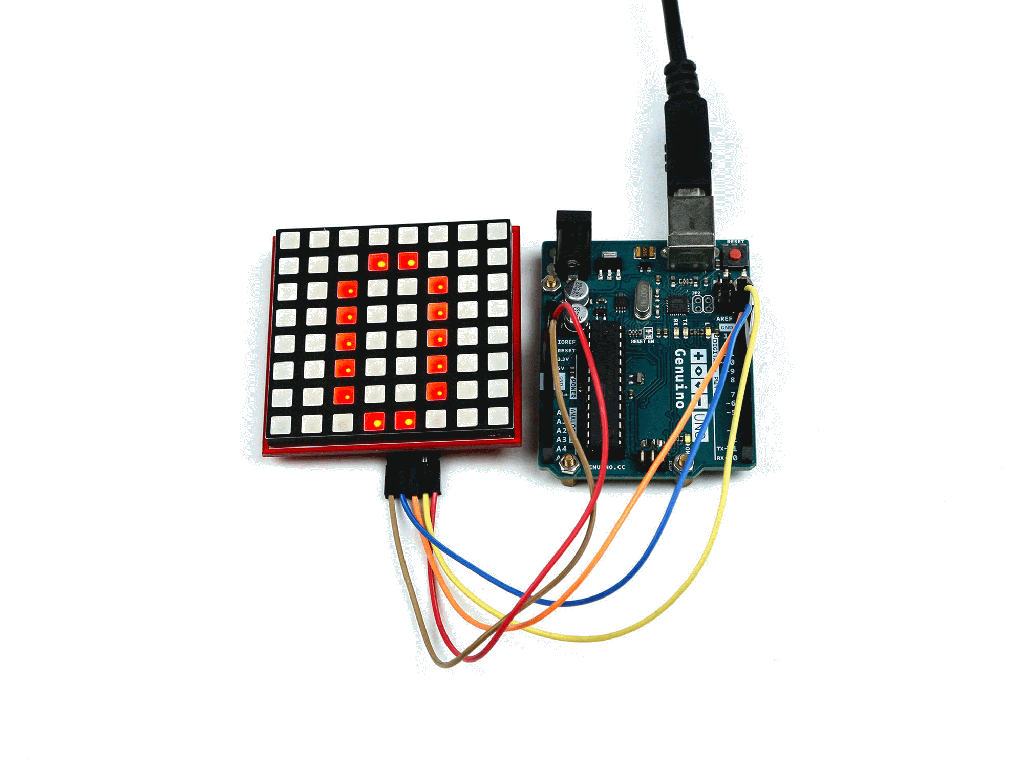
We established communication between Wekinator and Arduino by translating serial Data inputted from the Arduino into serial data for Processing for Wekinator to listen to on 6448. We tested different input components, like the potentiometer, buttons, and finally light sensors. We explored the interaction of the instrument quite a bit, going from one to three light sensors because we wanted a more complex and perhaps even collaborative experience. Then we recorded and trained the program etc.

Looking Ahead

What could we have done differently— if we had more time, or if we decide to come back and push this concept to another level, we talked about changing the look of the physical instrument in order to make the experience more collaborate, such as having a whole jar that represents a whole choir. We also discussed about training the program a little more or figure out ways to add nuance to the sound, as people were walking and trying out our instrument during the week, we noticed that people would try to manipulate the sound by letting a little light only and then move the lid up slowly and see if anything would change. But we only trained it so that as soon as any light is shined through the sound would begin playing.

We also discussed about adding a whole orchestra with other instruments, since it was difficult with the code we were using that required a constant sound. We tried using a timpani as a bass but it didn’t sound good at all, for example. The rhythm was too quick so the drum was getting cut off 0.3 seconds in.

Maybe adding different inputs like pressure sensors that can manipulate other aspects of the sound like the pitch or rhythm. Not only can other aspects be manipulated, the overall interaction would be more complex and dynamic.

AI Noise Ensemble

Crazy concoction of music! Not sure if this was meant to be pleasant to the ears at all, but having 5 groups with identical drum machine output and another with loud brainwave oscillator sound outputs was not gonna create a nice, harmonious music ensemble. Which I guess is why Daniel named it the Noise Ensemble instead.

Initial feedback from external guests. Many were curious as to how our jars functioned, peaking into the lid. We always had to explain “haha, it’s light sensors!” One girl commented that our instrument was her favorite, because our output / music produced was actually pleasant to listen to.

Presentations + Feedback

Many groups played with the technology offered by Leap Motion, one group stood out to me. Many groups simply played with different hand gestures without thinking about meaning behind those hand gestures. Manuel et. al‘s group however, really explored the gestures of Scratching that DJs perform in gigs. They used the same drum machine output we did, but swapped it into DJ sounds and trained multiple training gestures.

Felix et. al‘s group used the same technology as we did, the Arduino, which is why I also found their project to be intriguing. They designed a miniature violin that utilized both light sensors and pressure sensors to manipulate sound. I liked their project because essentially if we were to continue our project, we would’ve added additional sensors to establish more nuance in our sound, and we have contemplated about adding pressure sensors.

Our presentation didn’t receive feedback from anyone other than Daniel himself. Over the week, Daniel had demonstrated enthusiasm over our project. He had constantly been checking in with our group, asking how we’re progressing as well as showering us with complements regarding how he enjoyed the direction we took with his project. For the presentation, he recommended (following-up our own reflection) that yes it’s indeed an option to make the instrument more collaborative by increasing the space for interaction, perhaps the jars being larger in size, spaced out, and MORE! Daniel also talked about adding a smell dimension that could potentially increase playfulness of our instruments. Maybe smell would also be released when the lid is lift up, which could add another dimension for our musical ambience? Overall, Daniel was quite happy with our project and really liked the approach we took to actually make a “nice” sound.

TEI MI: AI— Seminar + Updates

Seminar:

All the supervisors we have seem to prefer a unique format of teaching that suited both their theme of the week as well as their personal teaching style. Today for the Seminar, Daniel had the whole class be a part of the seminar, and without having a class-wide discussion, each group was assigned to a question where they get discussed first privately within the group than publicly with the whole class. It was a more casual format of a seminar, but I enjoyed the laid-back atmosphere.

Since I don’t want to simply copy down every group’s response to the assigned questions, I’ll only be writing down the topics that I found interesting that sparked valuable comments and discussions.

Technology & Art

Technology makes tools, art makes meaning. Group 1 believed that technology have been aiding arts in reaching new limits, and how technical application have a power in making art appear more compelling. They also mentioned how technology can be applied in art to be used for the purpose critique and critical reflection. This topic of the blurred line between technology & art reminds me of Kosara’s paper from last week as part of our literature. He compares artistic and pragmatic visualization, how they differ, but also how the link between can be blurred (Kosara 2007). They are arguably on the opposite ends of the visualization spectrum , etcetera. I think technology and art are mutual exclusive in the sense that they don’t necessarily require dependence on one another, but that doesn’t necessarily entail a rejection of collaboration.

Sound-Oriented vs Movement Oriented

A question that I submitted! I answered, based on knowledge gained from the literature itself, that with sound-oriented tasks, focus is drawn towards sound by interactive system. While for movement-oriented tasks, the attention is placed on the movement itself. Group 3 answered by saying that different motor levels are paid attention to when putting parameters into performing a certain tasks.

Auditory feedback for Sensori-motor Rehabilitation?

We discussed this briefly for our question as well when comparing effectiveness of using sound in therapy rather than visualizations. Group 4 responded by saying that auditory feedback benefits patients by stabilizing action in a feedback loop, conditions, and helps realign behaviors. Research has suggested the general enhancement of brain activity and plasticity thanks to auditory feedback.

Why is Movement Deeply Connected to Sound?

This was the question proposed for our group, after our private deliberation revolving the topic we concluded that movement is connected to sound first and foremost due to our biology. Looking at the human’s brain anatomy, numerous neurobiological and behavioral studies have demonstrated that there is close interaction between auditory and motor areas of the brain. And there is a clear correlation between the perception of auditory information and movement execution and control. This was demonstrated via an example that was mentioned in the paper— the finger-tapping example, it showed that as a result of increasing the tempo of a song, a person’s tapping rhythm adapted to the speedier tempo by tapping faster. Which evidently demonstrates that there’s some sort of synchronization between our body’s ability to perceive sound and general movement.

These seminar topics were ones that I personally found valid to the theme of the week and ones I figured were valuable to note down.

Updates:

Regarding our Project— Musical jars

I managed to get adding vocals to work🎶! After consulting Jesper from the group that was tinkering with the drum machine continuous output example— who have managed to add at least 10 additional outputs to the original code, I learned that with this example it was possible to swap out the .wav files into your own and also add additional outputs! Following his guidance, I modified the Drum machine Processing code, I added an additional row / additional sample. With four rows now, I swapped out the existing drum beat files to new files.

Finding nice vocals happened to be extremely difficult, it was hard to scavenge for raw, a capella vocal .wav files where only one note is sung for an extensive period of time. I went on royal free .wav file downloading websites and searched for choral music, but I never found four distinctive voice parts to incorporate into our program. With the help of my boyfriend, who has experience in music production, he composed a chord with four unique voice parts for me to implement. Because the four notes were too close to each other, I found an additional soprano voice to add on top of the voices he provided me to bring in a higher note for a more dramatic effect. These files all had to be 1 second long, since the drum machine was more susceptible to taking beats. If the files were too long the song would sound chunky / static-y, if short, the sound would appear to seamlessly merge with one another despite actually being separate beats.

After getting the vocals to work, we composed a system in which we would visualize how the interaction with the jars would be laid out / what sequence we should use to introduce each layered vocals. In the end we trained Wekinator to learn the Basic Jar sequence to the left:

  • Default, when no lids are lifted— Bass note is played
  • Big jar lifted— Tenor part played
  • Middle jar— Alto
  • Thin jar— Soprano

What was one of my concerns when laying out the sequence this way was that when one bar is played and the other jar is lifted, the first bar would be cancelled and stop playing. It turns out after training this sequence that they actually built on top of each other, which means even though we recorded each lid-lift separately, when they’re all lifted together, they all work by playing sound altogether.

Map of potential scenarios of the sound sequences that we wanted to try

Here’s our final outcome:

Final demo of the ML Choir Jars

We went through some technical difficulties with the processing code constantly crashing, I still have a hard time getting used to how a whole program could refuse to stop working based on one small mistake like an additional right bracket }}, can someone invent autocorrect for code?? At some point the randomizing function stopped working, and also Wekinator could not listen to any serial input from the arduino at all and the drum machine also quit functioning. Turns out that we had missed one letter “f” in a piece of code, courtesy to Melika for noticing.

This week was great! We basically finished everything by Wednesday, which is something we have mentioned in previous weeks about improving— starting earlier to ideate and get to work earlier without pushing everything to the very end. I managed to learn a lot by myself just tinkering around with Processing code. I realized that with a lot of patience, programming isn’t that hard afterall.

This week was stressful in the sense that we have a lot of deadlines coming forth and I thought it would be smarter to leave additional time at the end of the week to give space to working for our other deadlines. My groupmates were very efficient in assisting each other in finishing the project ASAP, and I think we did a pretty decent job considering the little time we spent working on it. More reflections coming tomorrow!

References:

Bevilacqua, F., Boyer, E. O., Françoise, J., Houix, O., Susini, P., Roby-Brami, A., & Hanneton, S. (2016). Sensori-motor learning with movement sonification: perspectives from recent interdisciplinary studies. Frontiers in neuroscience10, 385.

Christopher, K. R., He, J., Kapur, R., & Kapur, A. (2013, May). Kontrol: Hand Gesture Recognition for Music and Dance Interaction. In NIME (Vol. 13, pp. 267-270).

Kosara, R. (2007, July). Visualization criticism-the missing link between information visualization and art. In 2007 11th International Conference Information Visualization (IV’07) (pp. 631-636). IEEE.

Macionis, M. J., & Kapur, A. (2018). ’Sansa’a modified sansula for extended compositional techniques using machine learning. NIME.

TEI MI: AI— Building our Instrument, using light sensors!

Follow-up from last post, after the workshop with Daniel, we coupled our Arduino board for it to send serial inputs via processing to Wekinator. First we tested on potentiometers, then Melika or Josefine came up with the idea of using light sensors. We decided that light sensors would add a different dimension to the interaction— mostly because it affords richer interactions, in the sense that the one interacting with the computer would not be needing to physically touch any component from the Arduino board. This play on tangibility where you can physically manipulate dark and light— but also not touch anything— would be an interesting interaction to develop and work with.

Arduino light sensor coupling

We started with one light sensor. Just like the potentiometer, we first checked if the Serial to Processing file was able to detect the Arduino input that change the value, and if it did, we would proceed by experimenting the interaction with a pre-made output.

After testing with one and seeing it worked, we tried with two, so two hands could both be involved in the playing of the instrument. That worked too.

Josefine strongly advocated for incorporating an additional light sensor, the more the merrier— she said. By including another sensor, we’re opening up an opportunity for a collaborative musical interaction, involving more than one person.

Then it was time to ideate how the instrument would look! My first idea for our light sensor experiment was having a dark mystery box where you would reach your hand into the “unknown” to manipulate the music. The reasoning behind this was so that we could shine a light within the box so that the light source and its intensity would remain constant. But that was when we only had one light sensor in mind, if this box were to have multiple sensors, it would probably be difficult as an intuitive instrument, since you can physically “see” what’s going on.

Mystery box instrument

Then Josefine proposed having three separate apparatuses that would contain the three sensors, we talked about more structure, boxed, rectangular prisms, but Melika and I mostly left the physical appearance of our instrument up to Josefine’s interpretation. I have good faith in Josefine’s prototyping skills so I was certain that she would create something we would all enjoy.

Whilst this was all going on, I was looking more into the code, tinkering and comprehending the code, and seeing if there’s any opportunity to switch out the music files so that we could also create our own songs in addition to simply creating a new interactive instrument. We were also influenced by our ambitious classmates with backgrounds in music production that were taking the drum machine example to the next level by adding their own beats and melodies. With a background in choral music and being part of choir since a very young age, I proposed swapping the .wav files into vocals, so we could somehow present a nice harmonization of different vocal parts and present that as a whole. Then, by manipulating the light sensors, we trigger the introduction of specific vocal parts. For example, we can train our program so that basses get introduced, then we introduce sopranos, then the tenors, and so on. Maybe even manipulate the sound by only having the sopranos and basses, the vice versa. At this point we haven’t thought too much about this yet, since I couldn’t figure out how to swap sound files in the All classifiers ChucK file.

Josefine created three cylinders of different sizes. These cylinders are capped with lids, so by lifting the lid, we introduce light in to trigger the light sensor, and vice versa. After hearing my idea of having different voice parts, she wanted to create cylinder jars of different sizes since her vision was that maybe we could have a deep sound, or a bass drum enter when the big jar was opened, then a high melodic sound be played when the thinnest cylinder was opened. She decorated these cylinders with traditionally woven ribbons that had tribal prints, so our instrument is not only functional, but also possesses an aesthetic appearance.

Inside these cylinders, we have our light sensors mounted at the bottom, attached to foam we found around the IOIO lab. We extended our wiring via longer wires also found around the lab. And ta-da! Everything works just as we imagined.

To put our music jars to the test, we set our output as the FMSynthesizer with the ChucK example. Below is a video of Josefine trying it out!

Top view of our music jars

TEI MI: AI— Kick-off, Experiments with AI, Tinkering with Wekinator

Last week, final brief of Module I!

Introduction to Wekinator & Brief

This week is all about Machine Learning & AI, but applied in an entertaining fashion! Using Wekinator— an open source software created for experimenters to utilize machine learning to create new musical instruments, gestural game controllers, computer vision, & computer listening systems. Wekinator can “listens” and receive inputs, whether external or internal in the computer (i.e Mouse XY), then process them to produce outputs.

By tinkering around with this newly introduced software, we open up conversations about how new technologies can augment creative work in the scope of music production.

The expectations from the supervisor is to explore and work with Wekinator and Processing, but to not limit ourselves with these softwares only— we can consider exploring Arduino, PureData, Leap motion, Computer vision & utilization of webcams, Brainwave detectors, Bitolino, etcetera. We are to tinker with the technology, explore, be open to having risks and failures but reflect on them, and also have fun!

The goal by the end of the week is to explore the opportunities Wekinator is capable of, by creating a Human-AI Ensemble. I interpreted this as using the Wekinator software to create a new instrument and a novel interaction for playing / presenting music. On Friday, we will be presenting our musical concoction as part of a giant class-wide noise ensemble as well as presenting / reflecting on our design approach, process, and implementation of technology.

The outcome of the project will be part presentation and part performance, so coordinating an ad-hoc performance to demonstrate the concept behind the instrument.

The potentials of Machine Learning & AI in IxD?

Machine Learning is a powerful tool because these trained algorithms are able to apply complex mathematical calculations to big data, repetitively and in a faster pace thanks to recent development. This creates opportunities for Interaction Designers to train computers to learn about and recognize the subtle nuances more complex interactions enhance product development, gesture detection development, etcetera. This technology allows machines to deal with and adapt to fuzzier and more complex knowledge

Experiments with AI

Exploring with Google’s AI experiments

To kick myself off, I decide to explore on my own what Google’s creative lab has already managed to achieve using AI technology.

First I played with Quick, Draw, bult by Jongejan et. al from Google Creative Lab. Quick, Draw is a digital drawing game built to guess what you’re drawing. When you begin the game, you are prompted to draw something, and a neural network tries to guess exactly what you draw. The programme is getting better over time, since the more you draw, the more the program will learn. This is a good example of using machine learning in a playful way.

Enjoy my ugly drawings

Then I experimented with the program Semi-Conductor, since it utilized a javascript machine learning library that we’re familiar with from Interactivity— posenet! Built by Rupert Parry and peers, it’s an experiment design to let you conduct your very own orchestra via your browser. The webcam utilizes computer vision / gesture detecture that targets your arms to change tempo, volume, and instrumentation. Since the week is all about music, I thought this would be a nice thing to look at perhaps serving as inspiration for our own project.

Main takeaways: This collection showcased really simple and comprehend-able experiments that gave a good overview of what machine learning is capable of in a playful way.

Tuesday: Workshop— Tinkering with Wekinator, using Arduino?

On Tuesday, Daniel opened with a workshop & tutorial of how to use Wekinator. Initially it sounded quite complex but as soon as we put it in action, the straightforwardness of the whole software interaction became more apparent. We are to download a Quick Starter essentials package, then, simply follow the title of each files, which was named as either an input or output together with the number of inputs or outputs, and also some indication of whether the type of output is all continuous or all classifiers. Then, when the correct information is inputted in Wekinator, we simply have to train the program into knowing which input behavior would trigger a certain output— for example, taking two outputs of sound & two inputs of mouse position as an example, we can train Wekinator so that it knows that when the mouse is on the left side of the screen, it should play a higher frequency, and when the mouse leans over to the right side of the screen, it would play a tone with a lower frequency.

Using the provided examples, Daniel demonstrate everything from the simple input of the position of the mouse on a window, to a ChucK synth output with four separate classifiers. I was quite quick in grasping how everything functions so moved on to tinkering with Arduino.

Example with Mouse XY (2 inputs) and Processing’s DrumSynth output with 3 outputs

As mentioned earlier, it was recommended yesterday that we could think about experimenting with other softwares. My prioritized interest was coupling the Arduino, with no specific reasons as to why. I thought with our previous experience with Arduino, it wouldn’t be as challenging as the newly introduced interfaces like Leap Motion etc with out limited programming skills as a group.

Without being aware of there being code pre-made and available for us to use to couple Arduino, Processing, and Wekinator, I did some research online. I read somewhere that you had to have some sort of Wi-fi component to your Arduino to be able to connect to the browser, and freaked out a little. But thanks to Daniel’s reminder that there’s actually detailed instructions on the Wekinator website demonstrating how to do this, I quickly jumped into that instead.

I was able to swiftly connect the three softwares, done easily by simply uploading first the Arduino code to the board, then running a piece of code via Processing that receives serial port data from the Arduino and sends it to Wekinator— to port 6448 using OSC messages, then finally opening our selected output, which so far was basically any example output we wanted to use in the starter pack, and running Wekinator to compile everything together.

I tested whether the connection was established first via buttons, but the featured values didn’t show up at all, maybe because the buttons only afforded two inputs, either on or off. So I quickly swapped out the buttons out and attached a potentiometer instead. By coupling the potentiometer, I was able to see the featured value on the serial to processing file change from 0 to 1023, which means the Arduino serial data is indeed being sent to Processing data! I quickly took this to the test by playing with the 4 classifiers output. I trained Wekinator so that the greater the value is (the farther to the right that i twist the potentiometer knob) the more layers are added to our baseline drum beat. See what I mean below.

When turning the knob towards the right, more layers of instruments are added

This marks the start of us building our AI instrument. We basically finished building our instrument on Tuesday as well, but since this day was extremely long I decided to spread the post into two instead. See the next entry for our instrument.

References:

Google Creative Lab. Experiments with Google.https://experiments.withgoogle.com

TEI MI: Inform & Provoke— Wrap-Up

This entry is dedicated to the wrap-up / final outcome of our project as well as addressing the feedback we received from the final presentation & reflections.

Wrapping-up: After we discussed the more abstract aspects of our concept, it was time to sketch it out and label our sketches using the Function, Behavior, Structure method. Prior to doing so, we formulated an opportunity statement just to specify systematically what we are trying convey in our project. We’re asking ourselves—

How can we provoke the audience by informing about gender inequality in the case of the female uterine cycle and its costs?

💡 FBS 💡

1️⃣ Concept

We titled our project the Bloody Business Ferris Wheel, the description of concept being “Giving Malmö City Her Very Own Uterus”, again, in reference to how Malmö already has a famous male phallic figure. It will be a Ferris wheel that people can enjoy by going through the cycle, as well as experience the costs by paying a certain for the ride based on where in the cycle you are

  • Placement we selected to be in the heart of Malmö city.
  • Unity & Coherency: Informative, provocative, but also provides the function of entertainment.
  • Durability: It would be a permanently mounted playful structure that can serve as a tourist attraction or a statement-piece that can represent Malmö. Sustainable building materials used.

2️⃣ Function

The Ferris wheel we’re envisioning of having is one that’s very loud in terms of being provocative regarding the message it’s trying to convey. It functions as a tool to raise awareness about how much females have to sacrifice economically to gain access to what should be considered as daily necessities, and to provoke the status quo of the topic of menstruation being taboo to discuss in public about as well as

  • We are raising awareness regarding the female reproductive system / uterine cycle in relation to money.
  • We are provoking the status quo by having a major female-represented structure— that’s commonly associated with innocence— in public.
  • We are communicating data based on the average cycle, price, and uterus structure.
  • We are attempting to change social stigma around periods by sharing a fun and liberating experience for people of all ages.

3️⃣ Behavior

Our structure has the basic function similar to that of an ordinary ferris wheel’s. It is an upright wheel that affords rotating, in addition to that, there are passenger-carrying components (we’re referring to as capsules) so that the audience can get a chance to physically interact with it by sitting in these capsules.

The behavior of the ferris wheel is powered by data— the data is drawn from an average menstrual cycle as well as the average cost women have been found to spend on products related to the uterine cycle. The cycle’s change in behavior is visualized by lights unique for each phase— pink for the proliferative phase, blue for ovulation, orange for secretory, red for menstruation, and brown for the final days of a period.

So how does this ferris wheel behave and how is it interacted with? It takes 28 minutes to go around— as an homage to the average 28-day cycle. The cost of the period cycle is provoked by the alternating price based on where in the cycle you are when you enter the ride (i.e when you enter the wheel when the ferris wheel is going through menstruation, you will be paying a much higher price than maybe the phase right after the period). We also briefly discussed about heat and smell components that can be implemented into each individual capsule which represents body temperature that fluctuates throughout the cycle as well as different scents women tend to emit in different phases. Essentially, every capsule goes through the full cycle of a 28-minute and individuals get to personally experience how it feels “every day”.

4️⃣ Structure

  • A Ferris wheel that resembles a round abacus
  • Steel construction, sustainable
  • Stable Platform to hold up our construction
  • Motors in the centre to power the ferris wheel
  • Heating function in capsule seats 
  • Scent diffusers to imitate bodily smell throughout the cycle
  • Light displays via LED lights physically attached to the structure as well as projections being lighted from afar
  • Decorative abacus pieces to pay homage to our original design idea
Structure in Detail

Information & Provocation

To Inform

  • The period has for a long time been a shameful topic to talk about
  • Public information about the menstrual cycle could make it more acceptable
  • Data
    • In Sweden, and other countries like Germany— female hygiene products are taxed at 25%. It’s treated like a “luxury” item. Why isn’t it taxed like a daily necessity?
    • In average, women [in Sweden] pay 15.000-70.000 kronor on menstruation supplies throughout their lifetime.

To Provoke

  • Connecting the menstruation cycle to a Ferris Wheel—a structure that been associate with fun, to lighten the mood regarding the stigma around uterine cycles, and the overall taboo of speaking about periods
  • Building a huge and eye-catching attraction in the heart of Malmö
  • Malmö has a famous gigantic phallic symbol, why not equalize the field

Presentations + Feedback 💬

Inspiring Peers:

I really enjoyed Malin, Zakiya & Felix’s group as they selected a quite sensitive and intrusive topic regarding Domestic abuse, and to inform the audience about how a lot of cases go unreported. I admire their choice of physicalization, since it’s not a physical object that was the take for most other groups, it was a room where people experience. They chose gusts of air pressure that blow from the back into the room you step into to mimic the intrusiveness of the topic of domestic abuse, which makes it provocative. I liked how they incorporated unity by joining lights and gusts of air pressure as a whole for the audience to expose themselves to.

I also really enjoyed Andrej & Manuel’s project informing and provoking about deforestation, via a hallway lit up by lights. The physicalization is also an experience more than a physical object. The interaction is carried out by having a person walk down a hallway, performing the act of “planting trees”, which is symbolized by lights lighting up on the ground, until you reach the end of the hallway where you face a mirror, and you see the lights behind you dim back down, signaling how the trees are quickly being cut down as soon as you plant them. Then, as soon as you walk back everything is reverted back to dirt. I thought it was an interesting a metaphorical way of presenting the damages of deforestation (5:1 ratio— trees cut down : trees planted), there is a sensitizing value to it.

Andrej (left) & Manuel (right) also built a small prototype to help visualize the hallway in a miniature format

I notice a pattern after reflecting on what I liked from other groups— I believe that the physicalizations that you got to experience first-hand inflict more information and provocation were more appealing

Our Presentation:

When it came to our presentation, I quickly realized as soon as we started that we had miscommunicated a little before beginning when it came to clarifying our concept. Melika was absent on Thursday (yesterday) so she missed most of the changes we made to our idea, which lead her to introducing the presentation by introducing how our concept revolved around the concept of the tampon tax, or how sanitary products for women are taxed higher that of men’s. The fact that the tampon tax exists and this idea of inequality between what’s considered as daily necessities between men and women was what stirred up the conversation regarding cost.

However, we had agreed yesterday that we would only address the overall cost women must contribute to cope with different phases in the menstrual cycle— including sanitary products, painkillers, condoms, birth-control pills, chocolate for cravings, and so much more. This could have been prevented if we had clarified our concepts to each other better prior to our conversation.

Otherwise, we received a positive response regarding how provocative our concept was. The presentation went well, we got a few giggles here and there, I assume it’s due to the fact that some of the student’s backgrounds might not be as open-minded as the students born and raised in liberal Sweden. As most of us probably expected, some voiced out about how the introduction regarding gender tax was confusing because our Ferris Wheel FBS had nothing to do with the tax itself, but about the overall costs. Julija wondered why we made the physicalization so entertaining, without considering the darker aspects of the menstrual cycle, such as the pain you experience during your period.

We did touch on this a little during our concept refinement, regarding seatbelts that can simulate and impose pain, but we never pushed it forward in our final iteration due to how provocative it already is.

Mali only had nice things to say about our project, she light how we addressed an extremely taboo subject and showcased it in such a provocative way.

Final Reflections + Looking ahead:

  • Maybe we could have done some sort of user-testing or surveying around to ask our peers whether they found our concept too abstract in the sense of the data presented being too hidden. Maybe also ask more for more personal / emotional feedback regarding whether our concept is too provocative.
  • We could have iterated a little more about how the lights are presented, such as the transitions between different phases, as well as the behavior of our abstract uterus structure projection.
  • If we continue with this project?
    • Using screens that are included in every capsule and have different genres of “films” playing— eg. period when one is more aroused: play pornography
    • Seatbelts that cause pain to mimic cramps
    • Including more dimensions regarding class and different social stigmas that exist around the world, ferris wheel presented in different ways based on which country we’re representing, etcetera

TEI MI: Inform & Provoke— Reuniting with Group mates + Creating a Uterus Ferris Wheel

Thursday:

Ideation + Settling on one concept + Illustrating our FBS

Prior to today, the group had been drawn towards a “female” subject. There has been a rise in conversation about women’s rights in recent years and feminist activism is prevalent in our society now— so they thought physicalizing something in that realm would be somewhat challenging the status quo, even though things have evolved a lot since the 20s.

In Caroline Criado Perez’s book Invisible Women, she takes on the invisibility of women in a world that has not only been designed by men, but with only men in mind. Urban planning, transportation, policy, design, manufacturing are overlooking the needs of half the world’s population— women.

The topic they landed with under the umbrella field of women was the talk about menstruation. Brief outline of what they wanted to physicalize was the menstruation cycle. Most people are aware that periods are more “taboo” to discuss about in a public or private setting— maybe not in Sweden but it’s definitely prevalent to this day in many developing and less liberal countries.

Image result for pad gif

In many cultures, there is a stigma surrounding periods, euphemisms substitute the name for menstruation, because it’s culturally taboo to call it by its name. As a woman who lived in conservative Asia in my teenage years, I recall having to refer to getting my period as “my that is here”, “my flood gates are open”, and asking for pads from my periods calling pads “strawberry jam bread”, because the image of strawberry jam spread on a slice of bread resembles that of a pad with menstrual blood on top. There’s also a social stigma around having to speak about periods with men. Since men cannot relate to having periods, women may not feel as comfortable discussing it with men surrounding them. “If you’re a girl who lives in a single-parent family with your dad, you could be too embarrassed to ask about your period or for sanitary products,” Claire Best told BBC News on February 24th.

Menstruation stigma is a form of misogyny. Negative taboos condition us to understand menstrual function as something to be hidden, something shameful. And by not naming a thing, we reinforce the idea that the thing should not be named.

Druet 2017

Why is there a stigma? References in menstrual taboo has been found dating FAR back.

It can be found in the Quran

“go apart from women during the monthly course, do not approach them until they are clean” Quran 2:222,

In the Bible

“…in her menstrual impurity; she is unclean… whoever touches…shall be unclean and shall wash his clothes and bathe in water and be unclean until evening” Leviticus 15

And this one, the most ridiculous statement in my opinion, from the first Latin encyclopedia in 73 AD—

“Contact with [menstrual blood] turns new wine sour, crops touched by it become barren, grafts die, seed in gardens are dried up, the fruit of trees fall off, the edge of steel and the gleam of ivory are dulled, hives of bees die, even bronze and iron are at once seized by rust, and a horrible smell fills the air; to taste it drives dogs mad and infects their bites with an incurable poison.” (1).

The topic of pink tax, or gender tax eventually surfaced. In many countries, sanitary products have an extra few percentage of tax applied on top of regular VAT tax, making it unaffordable for many. Sanitary products like pads and tampons have an additional tax similarly applied to “luxury” items, it’s called the tampon tax. It is estimated about 137,000 girls in the UK miss school each year because of a lack of access to sanitary products (BBC News).

In the end the settled on having the physicalization inform the audience about the menstrual cycle and how it works, as well as provoke the audience by raising awareness about the cost of periods. How we would carry this out was yet to be discussed.

Upon returning, the group had envisioned what they wanted the physicalization to look, they were mostly ideating surrounding the shape of a circle, to literally represent a “cycle” or the “circle of life”. They also talked about an abacus, for the economic aspect of the menstrual cycle. This was a good start for our ideation, we proceeded by making more illustrations for how we want our physicalization to look like.

Image result for circular abacus

I proposed combining both and having literally a round abacus, since that actually exists. That way, the aspect of Coherence would be achieved better, where we have both the idea of a menstrual cycle and the economic aspect of a period perceived as a whole. At this point, our concept was still settled with having a round abacus but nothing more, we had been talking briefly about the contextuality.

I built a physical round abacus out of cardboard just to experiment with how the abacus would be interacted with, since at this point, we thought we would have a big physical abacus that spectators could interact with. It revolved around how the audience could manipulate the abacus pieces that would trigger some sort of behavior. Then the image of having a sponge emerged, since it could look pretty cool if we manipulated it by introducing liquid, the shape-changing of a sponge could resemble an abstract structure of a uterus. Then the idea turned into having a sponge in the center of the abacus, where the sponge would move dynamically based on the input of the abacus pieces.

We did more sketches, created mood boards that depicts our concept development and started illustrate our FBS. I had an additional concept of how the physicalization could look, via a Lyre-shaped 2D plexiglass hung by strings that would drop abacus pieces from some sort of device holding the whole concoction from the top. The uterus structure (or blood flow) is depicted by red fluid that moves dynamically between the thinly attached plexiglass.

Mood board on left, Ideation post-its on right

In the end, we wanted to make the physicalization as big as possible, to enhance the provocation as much as possible. Looking at the round abacus we have in front us, I immediately thought about a Ferris Wheel. The structure of a Ferris wheel has a round rim, and bars connected to the centre motor that powers the entire ferris wheel, akin to our abacus idea.

So yes, our final concept was to build a massive Ferris Wheel. After discussing about the contextuality, we agreed that it would be placed in the middle of Stortorget, in the heart of Malmö city— a statement to complement Malmö’s existing phallic figure Turning Torso— A Ferris Wheel all about the female uterine cycle.

1. Unity— including both information and provocation in a single physical product.

Our concept adheres to Unity since it both informs about the female uterine cycle and the expenses women make to cope throughout the cycle as well as provokes by existing as a giant ferris wheel in the centre of Stortorget to raise awareness about the female cycle in its costs in a rather provocative way.

2. Coherency— being coherent as a whole. Form, behavior, color and provocation need to be in harmony.

We have aimed for our concept to be coherent, as the form and behavior act in harmony with each other. The structure itself is provocative, and its form (the Ferris wheel shape) supports the behavior the ferris wheel affords of spinning around, like having a walkthrough through the cycle (I’ll explain the concept more in-depth in the wrap-up post).

3. Contextuality— need to be designer for and be suitable for a specific place.

We have given our concept contextuality by giving it a specific place for it to be located at. We discussed about museums, amusement parks, but in the end we decided as its a statement piece it should be located in the heart of a city on a square that many people pass by.

4. Durability— be sustainable. It needs to have aesthetic and functional values that last in time.

It’s a tourist attraction, a statement piece, so it can last a lot in time. In addition to that it combines aesthetic and functional values (aesthetic with light displays, and functional value because it’s a form of entertainment and people can engage with the structure by being part of it). What we have in mind is for it to be built out of steel, and steel is actually one of the most sustainable building materials, and it just so happens to be the most recycled material in the world.

References:

Druet, A. (2019, June 6). How did menstruation become taboo? Retrieved from https://helloclue.com/articles/culture/how-did-menstruation-become-taboo.

Gordon, A. (2019, February 24). Period taboo: Why can’t we talk about menstruation? Retrieved from https://www.bbc.com/news/uk-northern-ireland-47254222.

Perez, C. C. (2019). Invisible Women: Exposing Data Bias in a World Designed for Men. Random House.

TEI MI: Inform & Provoke— Literature reflecting & Ideation on my own…

Since I had previously notified the supervisors for this week that I was going to be absent, I learned about the essence of this week’s topic / task and did the readings independently, reflecting individually as a substitution due to not being able to attend the seminar.

Paper Summaries:

The first paper introduced the concept of data physicalization and how to present data in a more ”tangible” way, considering that there might not be a mutual language between scientists and econimists for example, manifesting them into a physical form might help two fields that work with complete different sets of data come together and find a common vocabulary. The authors also address physicalization as a research area, since there’s so far a ”lack of an explicit distinction” (Jansen et. al 2015), research continues to assess whether physicalizations can be beneficial and the authors of the first paper have put out several arguments suggesting so. They consider it as favorable but not necessarily beneficial in all types of situations. They propose an open discussion about physicalizing data as a research area by providing a ”working definition” as well as addressed the challenges and unanswered questions about the research field. Their main proposition in this article however is mainly to acknowledge how physicalizations taps into the human’s highly complex sensorimotor system and help us efficiently extract information from the physical world, how they can heighten our active perception skills, helps cognition, and has other benefits like helping the visually-impaired perceive data using tactile cues.

The second paper discusses the link between technical and artistic ways of visualizing information, the author, Kosara (2007), proposes that there is a minimal set of requirement for any set of information visualization, and that it’s based on non-visual data, it produces an image, and the result is readable and recognizable. Then he goes on by comparing artistic and pragmatic visualization, how they differ, but also how the link between can be blurred. They are arguably on the opposite ends of the visualization spectrum (artistic visualization is to communicate a concern rather than to show data like pragmatic visualizations tend to be). He says that even though they’ve been “theoretically impossible to reconcile”, we shouldn’t necessarily shy away from the idea. He proposes a new way of thinking between the lines of pragmatic and artistic visualizations, stating that even though they have considerable differences they also share some aspects as information visualizations. Regarding proposing a new way of thinking, he also states that by pointing out differences between two does not necessarily entail a rejection of collaboration, it’s just the “first step” towards understanding how they could potentially “work together”.

For the final paper, I had a harder time understanding and interpreting it as being part of the same scope about physicalizations. The authors proposed the concept of “Tangible Bits”, these bits allow users to “grasp and manipulate in the center of users attention via pairing them with “physical objects and architectural surfaces” (Ishii et. Al 1997). Discussions about “background bits” and the human periphery are made (which reminds me about the glanceability week) as well as bridging the gap between “cyberspace and the physical environment” (which reminds me about faceless interaction from interactivity). I think this paper is maybe relevant because it talks about interactive surfaces and how to pair “graspable bits” which is essentially making digital information tangible. And that’s practically what data physicalization does. It’s interesting to put things into context considering how this paper was written almost 20 years prior to the first article how research in HCI has challenged this concept since.

More Personal Reflections:

  • I really enjoyed example of using physicalizations for the purpose of learning as a young pupil. As an extremely visually-reliant person (as in I’d rather look at pictures than text as a child), I strongly remember how physicalizations during science class i.e molecule puzzles strongly benefited my cognition, especially when It came to recalling a specific type of information, the information would be imprinted in my head due to having visually perceiving and receiving tactile cues
  • Super interesting how this field is interdisciplinary and visualization researchers,  psychologists, hardware enthusiasts and HCI researchers can all join together contributing their knowledge from their designated area of study and create the best design and implement the best interactions. I think this field is so exhilarating because it’s so broad in the sense that so many different disciplines can come together and answer unanswered questions etc. It’s also a really new field of research (Thesis topic maybe??)
  • Presenting information artistically/aesthetically and presenting information pragmatically/technically have hardly ever crossed my mind to have the potential to couple together. Until I was introduced to the topic of data physicalizations of course. In a way I would argue that when you physicalize data there’s always an added aesthetic value, since the concept needs to be coherent as a whole in terms of color and behavior etc. For example the Warning— Real Time Global Air Quality display (see figure below), the installation has a perfect blend of aesthetic and technical properties as it’s taking real-time data from the internet, then dynamically displayed both on a screen and on a physical structure lighting system which displays the digital aesthetics of climate change, etc.
Real-time Global Air Quality Display

Some questions that can be proposed during the Seminar?

  • Mentioned in David’s seminar in the first week— why is it relevant to look at papers that are written two decades ago, a decade ago and now?
    • I think it’s interesting to see bc see how HCI, technology has revolutionized over the years, more questions are brought up, some answered, new questions emerge. New vocabularies introduced.
  • “Tangible Bits”— How is this concept relevant under the scope of physical visualizations of data?
  • How can ubiquitous computing be facilitated into visualizing data physically? Why is the concept of Ubicomp even relevant here?

References:

Ishii, H., & Ullmer, B. (1997, March). Tangible bits: towards seamless interfaces between people, bits and atoms. In Proceedings of the ACM SIGCHI Conference on Human factors in computing systems (pp. 234-241). ACM.

Jansen, Y., Dragicevic, P., Isenberg, P., Alexander, J., Karnik, A., Kildal, J., … & Hornbæk, K. (2015, April). Opportunities and challenges for data physicalization. In Proceedings of the 33rd Annual ACM Conference on Human Factors in Computing Systems (pp. 3227-3236). ACM.

Kosara, R. (2007, July). Visualization criticism-the missing link between information visualization and art. In 2007 11th International Conference Information Visualization (IV’07) (pp. 631-636). IEEE.

Long-distance Ideation

I did some ideation Monday night just about ideas I think have potential to be physicalized… in addition to that, I created a mood board of pictures of physicalizations I found from the Data Physicalization library that I found interesting and suited my interests.

My interests were targeted towards weather and clouds, population, health hazards, over-usage of technology, as well as earthquakes and geological statistics.

  • A seesaw to demonstrate how many people born and die each day
    • Seesaw leans towards one side more when one value overpowers another
    • Equilibrium when both stats basically same
    • More informing and talking about facts, maybe provoke for developing countries that are decreasing in population to have more children
    • Contextuality: Doesn’t necessarily belong in any specific context, can be an art installation
  • Population pyramids (age-sex pyramids)— Inspired by the Mexico population density physicalization from the Jansen paper
    • Idea of visualization (see above) this type of graph that shows the age-sex distribution of a given population
    • Similar to the idea above, inform if one sort of population is reproducing more than dying
    • Would be fun to build if we want to try physicalizing it ourselves!
  • My air pollution choker that chokes when air pollution levels are high based on live data from World weather API haha!
    • More about provoking, like the lung sculpture that does live breathing, instead of seeing it happen however you feel it, very personal
  • Physicalize most used words on dating websites / tinder conversations
    • Could be funny, more playful, interesting, relatable
    • Can provoke if we see a negative pattern 
  • Immigration and Emigration in Sweden
    • Could be a little controversial but I’m not proposing this to provoke anything more to inform 
    • I’m actually more interested whether people are also emigrating
  • How many books are read each day in this modern electronic world
  • Physicalize average number of hours people spend on social media— by age? Country? 
    • Informing real time data
    • Provoke the overwhelming usage of social media and how that’s affecting the younger generation
    • Aim to provoke, in a negative way? 
  • Some data fetched from Google Analytics for some website maybe? Eye-tracking? Perhaps physicalize that?

Mood Board

TEI MI: Inform & Provoke— Kick-off!

This week’s theme is all about informing and provoking— using data physicalization. The week is led by Mali, an associate senior lecturer at Malmö university with a background in Product design, Industrial design, and Interaction design. Mali’s research and interests revolve around design in HCI including design for self-reflection and sustainability, forms and aesthetics of computing objects, as well as critical interaction design processes.

I had to be away Monday through Wednesday of this week, so a major part of this week was done independently in a distance such as reading the presentations, reading and reflecting on the papers, as well as doing some preliminary ideation for my peers to reference when conversing about the project when they meet physically.

Reading the presentation, the lecture was kicked off discussing the concept of data visualization. Data visualization, to be put simply, is creating a graphical representation of data, or according to the quote provided by Mali in the presentation, is “the use of computer supported, interactive, visual
representations of abstract data to amplify cognition (thought).” Think pie-charts and bar graphs. It’s closely related to fields like information visualization, scientific visualization, and visual analytics.

Related image
Infographics are often used as a method of visualizing data
Image result for infographics
“Graphics and visualizations give us a method to use images to describe a story in a way that we can understand. If children want to comprehend the world around them, infographics can do that” — Simon Rogers

The aim of visualizing data is to augment the human in understanding data. Digital displays have clear strengths, where it’s capable of conveying visual imagery that is rich in details. Some people might not find an array of numbers intuitive, and a visual guide could potentially serve as an aid. However, the main challenge still stands where there is a lack in technique for turning abstract data into easily interpretable and perceivable representations.

Data Physicalization, on the other hand, facilitates reasoning by making data appear tangible so users can interact with it somehow. Humans can interact with digital information by using their natural capability of perceiving to physically manipulate objects and materials. Furthermore, adapting data “from flat displays into the physical world could create novel and useful ways of exploring, experiencing and communicating data.” It’s been commonly used for scientists, for example, to help solve problems.

(Left) Model of black beetle virus, (Right) Model of HIV protease, target for AIDS therapy

Having these structures built help scientist and doctors first of all, investigate better because it’s much easier to interact with compared to simply analyzing it through a telescope. I imagine by interacting with these “viruses” in a dynamic way would help scientists notice more nuances and can benefit them in finding cures more efficiently. They could perhaps even modeled to act like how the real molecules would function, so they could even test with chemicals to see if they make an impact on the structure physically, before testing it on living organisms.

Living Map: Precipitation Visualized
with Moss. It visualizes the change of
summertime rainfall in Europe.

A branch of physicalizing data is making it dynamic, a method of making data physical is simply 3D printing some sort of structure, but a dynamic data physicalization can be interacted with, and interact with itself. They can be updated, or update themselves. Some examples are building blocks like legos that you can build and update yourself or a Tangible User Interface that combines physical components to digital.

Physicalization that simulates breathing movements of lungs to demonstrate impact of air pollution

Brief:

To Inform and Provoke

via Mali’s presentation

Informing is all about providing information that is supported by facts and data. To create a physicalization that informs, we have to use specific statistical data in order to facilitate knowledge in spectators / give an overview of what we’re trying to show. It’s more passive and also general, in the sense that if a physicalization is only informative, it doesn’t direct towards any target group.

Provoking on the other hand, is all about being direct and calling forth for an action, it’s more demanding, contrary to informing being passive. A provocative artifact can have a character of delivery that’s provocative. It also inflicts emotion, which means it can give rise to a particular feeling.

The Brief of the Project:

The goal of this week is to produce a data physicalization that both informs and provokes. We get to select a specific area in addition to the ones Mali has proposed, which were Sustainability, Diversity, and Design Processes. There should be a unity in both providing statistical information as well as be provocative in the single physical object we build.

Each group must consider four main aspects and ensure that our concept meets all four—

1. Unity— including both information and provocation in a single physical product.

2. Coherency— being coherent as a whole. Form, behavior, color and provocation need to be in harmony.

3. Contextuality— need to be designer for and be suitable for a specific place.

4. Durability— be sustainable. It needs to have aesthetic and functional values that last in time.

For the presentation, we are to create a detailed FBS illustration to demonstrate our project, as shown below of the lung installation in Amsterdam that was shown earlier in this entry. We don’t necessarily need to build a physical prototype, but we need to demonstrate our knowledge of our project thoroughly by providing illustrations and detailed explanations

References:

Ghajargar, M. (2019). Data Physicalization: To inform + to provoke [PowerPoint presentation]. Retrieved 25 November 2019 from Malmö University

Stuart K. Card, Jock D. Mackinlay, and Ben Shneiderman (Eds.). 1999. Readings in
Information Visualization: Using Vision to Think. Morgan Kaufmann Publishers Inc.,
San Francisco, CA, USA.

TEI MI: Smell— Wrap-Up

Like I mentioned in the previous entry, due to having to leave for abroad due to personal reasons, I wasn’t able to attend the presentation on Friday as well as the wrapping up of our smell game. Most of the information here that I’m providing regarding the project is all made possible thanks to my peers.

The material used for the Scratch n’ Sniff marks that represent the words was thin cardboard, the technique of encapsulation was executed using wood glue and a component of smell— in this case, the essential oils, rose water and orange blossom water provided by Simon, as well as two older perfumes provided by Josefine.

Scratch n’ Sniff seemed the most appropriate because as introduced in the class, it’s the best developed way of encapsulating smell, and it has been incorporated many times in board games. In the presentation he had mentioned that Scratch n’ Sniff is a “low-tech solution to the problems of distribution, synchronization and sequencing of scents in mediated experiences.” (Niedenthal 2012)

They printed labels for the name of each scent, representing the “word” aspect of With Other Words, the labels were then glued to each card. The scent was mixed in with glue and then painted over each card with their designated scents. The essential oils blended seamlessly with the glue, and when I tried the cards myself, I couldn’t detect the glue smell at all.

Josefine’s scented card fan

Regarding the presentation, I only heard scattered chats about what went down. Simon apparently didn’t give much attention to or critique our project, maybe because it wasn’t interesting to him, or maybe it was informative enough for him to have to ask follow-up questions. I wasn’t there so I’m not sure about what the atmosphere was like, but generally according to my peers it was quite awkward and a little underwhelming.

Maybe Simon could’ve provided feedback at all. Teachers usually provide feedback no matter how great or senseless projects are. That way, we would’ve known how we should tackle the next project, what we could improve on, etcetera.

 ✨Reflections ✨

This week was quite refreshing in the sense that we had a lot of fun exploring a new sense that people don’t usually think about alongside of interaction design / anything digital that involves design, reasons being that it’s a scent the most difficult to grasp. It’s very interesting to tackle a field that’s still in development that doesn’t have clear solutions yet. It was interesting to learn and “hear” about its potentials but perhaps the actual brief didn’t really take us to that level of understanding.

Regarding our week in hindsight, like I’ve mentioned in a different entry, maybe we could’ve started the process a little earlier, but the brief was also only revealed on Wednesday. However, most group already had quite solid concepts by Thursday so maybe that’s something we can learn from our peers, to not underestimating a brief and pushing it to the last minute no matter how “simple” it appears to be.

The workshop was no doubt the most interesting moment of the week, where we got to explore with different encapsulation methods. But it would’ve been more revealing it we would have gotten the opportunity to test with multiple encapsulation methods for our game, but given the sparse time, the direction we had to take was to quickly choose and idea and GO with it. That we didn’t do—which clearly bit us in the back this week.

TEI MI: Smell— Seminar 21 November + Ideation

Seminar

This Seminar was vastly different from the seminar last week we had with David. During my own experiences with seminars, they tend to be more serious where everyone’s required to at least speak up at least once, and some debates usually occur when two opposing opinions emerge.

For this seminar however, it felt more like a big discussion and critique session where Simon talked a little bit about his research and asked us if we had questions about the papers for him. In addition to that, he went around asking about each group’s concepts and aimed to help those lost get a direction. This was probably helpful for those who have formulated a concept prior to today, for the rest however, it was probably just a session where you got to sit around listening about the ideas by your peers.

I took some notes anyways regarding what was mentioned during the seminar, most of these were aimed at helping groups find a direction as well as discuss about how scents should be “packaged” in our games.

Key points:

  • Group learning to smell better also also improved visual learning, smell betters cognition
  • Smell is a “master key” sense, there is a special relation to brain regarding memory
  • Getting rid of a scent in order to introduce a new smell is a challenge (Serious problem with smell o’ vision) Good example when testing a perfume for yourself and everything starts smelling the same over time, coffee is often used but it doesn’t actually remove smell, not effective according to simon.
  • Smells usually described through association (good to think about for our game
  • Smell has No 3 smell primitives like RGB, never going to be consistent amongst people
  • The concept of encapsulation— we have to think about how we’re going to carry out our “smelling” experience for game, must encapsulate well to prevent cheating, mixing of smells, etc. Need to think about how we want to “package” our smells, and how to “deliver” our scents Scratch n’ Sniff is a good example of micro-encapsulation

Not going to lie, the seminar left me quite confused, though it was pleasant for most that the seminar was not as formal and demanding as the previous week’s. I was left confused as to how to begin our project, and was left even more concerned due to the fact that everyone else seemed to have already ideated enough to have solid ideas to consult Simon about. Sadly, I didn’t feel like the seminar really “benefitted” me in anyway, other than performing as recap for the literature. It felt more like a giant critique session.

After the seminar, or should I say, discussion, we jumped to the next room to begin ideating.


Ideation

We picked up with ideation rather slowly, it felt like most of us felt uninspired, perhaps most had the same thoughts as I do— feeling unmotivated after comparing our group’s progress to others, and also feeling not so enriched after a not so informative seminar. I won’t however, put words into my peers’ mouths. These are purely my thoughts and opinions.

None of us really had an idea of what to do, ideas brought up were being dismissed a whim for being illogical in relation to the brief. At some point, the ideation became quite stagnant, all of us grew silent stopped proposing ideas.

The idea of using Med Andra Ord as a game design inspiration surfaced. Med Andra Ord or With Other Words, is a board game similar to the game Taboo or Catchphrase from the United States, it’s arguably similar to Charades as well, in the sense that we’re guessing specific terms based on information provided by your peers, but Charades involves acting instead. Both game concepts are greatly similar, but since we discussed about With Other Words during ideation, I’ll focus on introducing that game instead.

With Other Words is a Swedish board game where players play in teams of two, amidst of up to four teams, which means one team can compete with at most three other teams. The board game presents with a bag filled with tags labelled by words that could represent objects , ambiences, people, anything. The goal of the game is to able to have your teammate guess as many tags as possible, the tags are then collected and whoever reaches the top of the tag holder first, wins.

The idea is that when a word is presented, you must explain the word you’ve gotten to your teammate without using the actual word or part of the word on the tag. So for example, if the word is “school bus” you may not say “the bus you take to go to school.

The twist for our smell game would be that scents would be presented aside of words, so we’re adding another dimension to the typical word guessing game. It goes like this:

  • Two or multiple teams with two teammates
  • When it’s one team’s turn, they draw a card that has a word
  • Scent be implemented somehow (at this point it wasn’t established how the encapsulation of scent will be carried out) for the non-guessers to collect their thoughts and think of words to describe the scent, maybe through association with memories or just practical description if the non-guesser is aware of what the scent is
  • The team with most scents guessed wins

When it was initially proposed, I saw the game as a good challenge for players because I was aware of the smell center in the brain bypasses the language center, which means that it’s actually hard to put words into describing smell— this phenomenon is called the “Tip of the Nose” (like “tip of the tongue”, haha). In my opinion, when I proposed it, I thought it would be a challenging game that’s easy to prototype via encapsulation, though it might have come off as rather senseless. There’s nothing wrong with a game being challenging, I thought.

To add a dynamic twist, Melika proposed making the game fast paced by incorporating a timer, like the “hot potato” in the game of Catchphrase. The idea is to pass around a ticking time-bomb and you are to avoid holding the bomb when the time stops ticking, therefore it’s important to guess as quick as possible.

I had to leave due to work so I had left the rest of the ideation for the remainder of the teammates, of course letting them decide whether they wanted to keep the idea or not (as it was the best we had at that moment). I felt bad for leaving but at the point it felt like the discussion for quite static and sluggish.

Image result for med andra ord

I know our teammates broke away from the idea, such as coming up with an idea of physicalizing the game minesweeper and incorporating scent. Most were skeptical because a game purely revolving around words might not be a perfect match for redesigning with additional olfactory dimensions. In the end they settled on the idea of With Other Words anyway, and executed it by encapsulating scent via Scratch n’ Sniff cards with labels.

Overall I felt the communication felt off today, some of us had no opinions to say but also appeared distressed in the face. Which really hindered the process. I don’t know what would have made the process better than maybe starting ideation a little later so we’re not pulling up things last minute the late afternoon before the day of the presentation. We would have avoided the situation where everyone’s tired and stressed.