The lecture consisted of the idea of being able to back up your design choices by using data as a way of moving your design idea forward and justify the choices within your design idea.
When you do something in life, anything almost, it always have to be justified with an answer or a motive for your action. This goes hand in hand with design. In a world where analytics rules, design is becoming data-driven. Data forms the cornerstone a product development process; it can quickly inform development priorities for enhanced user experience, improved user satisfaction and increased adoption rates (Babich, N. 2017). In design, you often have to be held accountable for your design choices. When you want to argue about or defend a certain design, you could use data to back it up. Analyzing data could serve as a way of knowing which design to use , though you will need to be sure to have enough users in your user group to draw such conclusions.
A good example and exercise we used to practise this is using a tool such as Google Analytics to get data on how people that visit the site behaves, amongst other things.
Concepts Introduced:
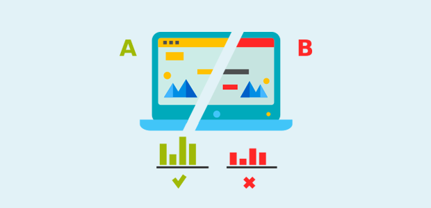
1. A/B Testing: Validating design decisions, proving. You compare two or more versions of a webpage, app, screen, surface or other digital experience to determine which one performs better.
2. Analytics: Using built-in programs or a third party service, such as Google Analytics. See conversion rates and user engagement to reveal whether a specific version had a neutral, positive, or negative effect. These improving tools are helping designers to make sense of data and provide insights for making better design decisions.
3. Technology Probes: Understanding the situation and understanding the situation & concept. Results help you improve campaigns, customer experience and conversion, and sharpen audience targeting.
Why use data?
We use data to create functional prototypes. Artefacts are usually always connected, they can be changed remotely without the user knowing. With digital products, you can keep developing and changing. We must also use data to validate and help navigate different visions.
Reflection:
The world is changing, and as designers, we have opportunities in front of us to rethink how to work with data, and how to drive meaning and insights from it. We should use these opportunities to make better design decisions, ultimately creating better prototypes to test and final products for users.
To kick the project off, I started by looking through the Google Merchandise Store, both the OS desktop display as well as exploring the mobile version. The mobile version was polished and easy to rummage through, though compared to the desktop website, not as many product and categories are displayed and advertised on the main page.
Screen-capture of Google Merchandise Store on macOS.
Screen-recording of Google Merchandise store on iOS webpage.
As you can see, the mobile version of the webpage appears to be much more animated and responsive than the desktop page, the desktop has more static product pictures that don’t ease in like the products in the mobile page does. However, a limited amount of items is displayed on the main page of the mobile site. It also seems like pretty different products are being advertised too! Where the desktop sites seem to be advertising more apparel, and the mobile site advertising more stationary products and other miscellaneous items.
I began my quest to explore user-engagement with the desktop site compared to the mobile site, and investigating the relationship between these two devices.
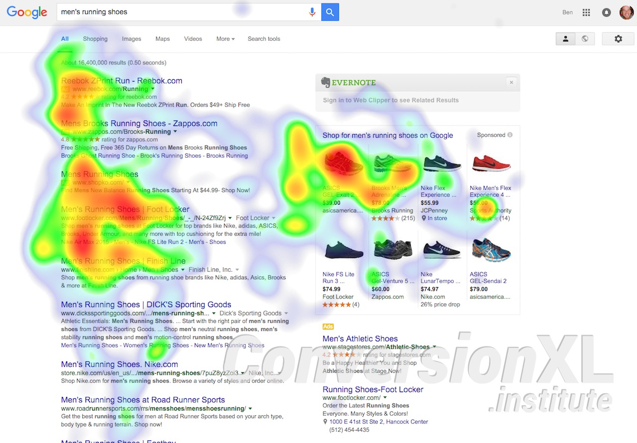
Looking at the data provided by Google Analytics on usage across different devices, you can immediately observe that there is an overwhelming difference between Desktop and Mobile users on average. On Average (data provided what was collected between dates 19th through 25th of May), there is an average of 9,400 users out of 13,234 in comparison to a whopping 5,921 difference from the Mobile users, landing at 3,479 users only.
Insight from Comparison between Mobile and Desktop:
Looking at these numbers a little closer, I observed that despite the fact that there are way more users, visits, and sessions coming from the desktop, the category addressing the revenue the website makes (the income for the store), transactions made, and the e-commerce conversion rate is being dominated by the mobile users. To make sure that this was not just based on pure coincidence I looked into the statistics from the past month as well and noticed that there is indeed a pattern.
Because the exact price/revenue the company makes on the website does not necessarily distinguish which device/version of the website is doing better at prompting its users to buy their products (Because there could be less transactions on one version of the website but more revenue because desktop users are spending more money on more expensive products), I’m mainly focusing on the category of the E-commerce Conversion Rate. The E-commerce conversion rate is the percentage of sessions that resulted in an e-commerce transaction. To be simply put, it’s looking at how many users that visited the site actually purchased items.
E-commerce Conversion Rate of past weekE-commerce Conversion Rate of past 30 weeks
Analyzing the statistics drawn from the past 30 days, you notice that only 0.12% of the total site visitors actually purchase items from the store. Of those 0.12% of the total users (54,603), 0.27% of mobile users actually completed transactions (51 out of 15,409) and on the other hand only 26 out 37,814 desktop users complete their transactions, leaving them at 0.05%.
We can make some assumptions for this phenomenon, why does it occur? The first thought I got was that the mobile version might have an interface easier to use based on how long it takes (how many presses) to complete a payment. I ran through the steps on my own on both the mobile version and the desktop version, faking a transaction. I noticed that it actually takes almost the same amount of clicks to get to the final payment page, the only difference being that when the desktop page redirects you to sign in to your google account first before completing the payment, and you complete signing in, you get redirected to the product page again, not even the shopping cart page. Every time you access the check out page, you need to re-sign-in, and this same thing occurs. It’s much quicker to sign in to your google account on your mobile app, it takes a simple click to select which google account you would like to use. On the desktop version you must key in information every use. So that might have been what severely delayed some transactions. Though in my opinion I don’t think a desktop user would first get redirected to sign in and give up to use the mobile version instead when the restarting of payment is prompted on the desktop screen.
Check-out page.
Once you select Check-out, you get redirected to this page.
I believe that this might not have anything to do with the interfaces of the two versions at all, I suspect it to be something else.
Most users consume content on their phones with greater ease. I use my phone for most tasks other than school related assignments such as research, programming, editing, and typing up essays, as it is much more convenient than using my computer, because I don’t carry my computer everywhere. Maybe the reason behind there being a larger traffic in terms of actually purchasing customers on the mobile version of the website simply because these mobile users saw some sort of advertisement outdoors on a billboard, or at a convention, and quickly purchased these items on the mobile phone because it’s more “convenient” to do so, than pulling out their laptops and computers. And most of the time, you only ever use desktop computers at work (which I suppose is when merchandise purchasing is NOT done), or at home, and people generally browse around and “window shop” on their computers more than on their mobile phones, maybe.
So this whole argument is based off of the assumption that people generally complete purchases on their phones more due to the fact that it’s far more convenient and easy to access on-the-go, in comparison to desktop users.
Suggesting an improvement to the store
Because I can’t really help the fact that a smartphone is designed to be easy to carry around and use in your hand and a desktop computer is not hence the reason why a lot of people resort to using phones for specific functions such as online shopping, I will simply discuss some slight changes that could be made to the desktop site to improve the overall performance.
Perhaps prompting the Google sign-in as soon as you enter the page will improve the efficiency of shopping significantly. One major question I have is, since the Google Merchandise Store is under Google, why isn’t it already automatically logged in to your Google account when you enter the page? I understand that some people might not have logged in to their Google account but I definitely did. Perhaps making that automatic would also increase the conversion rate and invite more users to want to stick around and purchase the item they put in their cart.
Another option is to have the option to proceed to checkout without logging in to your Google-account, it could potentially increase the buyer’s willingness to stay focused on complete the purchase. According to the Data & Prototypes Slides, Sales and Conversion Rates went up by 45% when given the option to not have to sign-in with an account to purchase items.
A/B Testing, Sketching a B for the check out process
Making the main page of the website, making it more inviting, could also invite more users to stick around. Though according the the statistics, more sessions are partaken by desktop users. At the end of the day I can only argue that it’s a culture to shop on your phone because it’s easy to access on-the-go, whether you’re on the way to work and see billboards at your bus station, or if you see something while you’re roaming around in the streets or at a Google convention.
Reflection:
What kind of Data was this?
Quantitative Data! This type of data tells you what is happening (or not happening). It’s most commonly numerical data– percentages, numbers, etc.
In the context of a website, Google Analytics can tell you how many visitors has come to your website, how they got there and what actions they took. What this data doesn’t tell you is why. Why does a certain group of users take one action, while a different group prefer another? Why do people end up completing purchases on the mobile website more than the desktop one?
The ‘why’ aspect is of the highest importance because it opens the mystery of user logic. That’s when we turn to qualitative data.
Investigating the Google Merchandise Store through Google Analytics.
What is Google Analytics?
Google Analytics is a web analytics service offered by Google that tracks and reports website traffic, currently as a platform inside the Google Marketing Platform Brand. (Wikipedia)
It is the most widely used web analytics service on the web.
With Google Analytics, you get an opportunity to really understand the way your customers are engaging with your site and app. And through that you get insights and draw conclusions on what’s working and what isn’t. You can uncover the insights that drive real results. It provides comprehensive digital tools to help its users better understand their customers and evaluate their site, content, and products. (Google Marketing Platform)
Despite their seeming omnipresence, Google web analytics and the company’s Google Analytics platform often feel unexplored in terms of utilization of their innate features. In that context, it is important to fully explore Google’s web analytics and its accompanying tools for the purpose of being able to make sense of the oceans of data.
In this Google Analytics Assignment,
We are to use these analytics to identify an insight that suggests an improvement for design, or that might serve as a worthy starting point for future investigation. I will first frame a problem with respect to quantitative data, then suggest improvements and create insights in the latter part of the next journal entry.
Mondays lecture revolved around terms such as Critical design and Design fiction. Going into the lecture we had some reading to be done, Gaver and Martin – Alternatives – Exploring Information Appliances through Conceptual Design Proposals, a text that introduced me to the realm of critical design, in the form of concepts created to raise questions and not necessarily solve design problems in todays society. It seems, in a sense, as a form of anti-design, where the purpose is to challenge the ideas that we see today and perhaps raise awareness to why they should be changed.
During the lecture, Clint further introduces the concept critical design. The term Critical Design was first used in Anthony Dunne’s book Hertzian, though design as critique has existed before under several guises. Italian Radical Design of the 1970s was highly critical of prevailing social values and design ideologies, critical design builds on this attitude and extends it into today’s world (Dunne & Raby).
Critical Design uses speculative design proposals to challenge narrow assumptions, preconceptions about the role products play in everyday life. It’s more of an attitude than anything else, a position rather than a method. There are many people doing this who have never heard of the term critical design and who have their own way of describing what they do. Its opposite is affirmative design, as affirmative design reinforces the status quo (cultural, social, technical, economic) of global capitalism. For example, he mentions relocating industrial design from a commercial orientation to questioning it instead (what it stands for and what the values are), the concept introduces designing to ask questions.
What is Design fiction?
Design fiction is explained as design which can influence the future in some way, either by questioning our technological advancement or introduce us to new solutions that, al though at first glance seems science fictional, still could be introduced as a new product on the market.
Critical design has its relation to prototyping
As the defining characteristics of prototypes is tenuous, material, and experienceable, and Cross-over of activities & techniques being: scenario constructing, prototype building, mock-ups; their motivations can sometimes be aligned, especially in regard to prototyping to understand the situation.
Issues
There are also some issues with Critical design, one should avoid exploiting ‘cargo cult’ phenomena (Holmquist 2005), avoid parody, one-liner, constructively building knowledge & integrating into design process, and also knowing when it is done well, or how to do it well.
Conclusions from the lecture with Clint
Critical design, speculative design, design fiction: no hard lines between them, there’s ambiguity
Designed artifacts to probe, provoke, question
Challenge status quo
Inquiring stance
As always: can be a useful attitude to adopt, but do it with care, and follow-through
According to Clint Heyer’s presentation on user-testing, you’re testing your prototype with potential users while focusing on usability, understanding not necessarily the situation or material, and really posing the question: “What are you curious about?”
We’re approaching the end of the double triangle now, where developing potential solutions and delivering solutions that work is coming into play, and it’s important to address that your goal should be to gather as much feedback as you possibly can as early as you possibly can. This helps you to identify any design issues before you get to the expensive stage of the process when you reach the final build. It’s too late — and too expensive — to leave user-testing until after you’ve built your product.
He also emphasizes that user-testing is not simply questioning the premise, counting approvals and disapprovals, and collecting opinions.
There are quick and dirty examples for user-testing, that includes:
Observation
Video analysis
Think aloud
Use & Interview
Let’s focus on observation and using and interviewing, as I believe these are the two of my main strategies of user-testing.
People observe observable interactions when there are available users in authentic settings, it’s a useful way of testing because it’s natural and involves rich settings. However, details get lost easily as setting a scope is necessary. It’s also hard to generalize and is time insensitive. An example for observation would be to devise a scenario and goal, then set the scene for the participant and ask them to reach for the goal. For example, when I was testing the same function of the app I had issues with, I guided the observation by setting the scene, saying “imagine living in Sweden and having many relatives and family abroad, try to quickly find the temperature and weather of condition your home country and also try searching for it if it’s not saved”. Then, I observed how the users interacted with the original app to validate my reasoning for reconstruction.
Use & Interview could also be necessary for user testing because having open-ended discussions grounded in lived experience helps the designer take a more active role and also introduces rich qualitative perspectives. It’s necessary when particular topics need to be probed more deeply but it can also be time consuming and people can struggle to account for action. At the end of each user-test, I always followed up with short interviews and questions wondering why the user interacted with the app a certain way but not the other. Those were insightful and really helped craft an idea for the reconstruction of the app.
I would definitely try out the “think aloud” strategy in upcoming design processes as I think setting the scene for participants then asking them to reach for the goal by thinking aloud. Pace of talk can match analytical focus and it’s nice to understand people’s reasoning processes.
My plan for usability testing was to simply let the users try out my reconstructed prototype and observe how they interact with it. Then, after observing their initial interaction, I opened up discussion and asked them about how it felt while interacting with the app and what can be improved and so on.
Pre-reconstruction observations, some users have noted while using the app that,
It is indeed difficult to locate the list of saved locations page
The location text is way too tiny
Based on observation, I noticed that the app’s not clear with what icons afford button-press, which resulted in user’s tapping around to discover functions through trial and error
Post-reconstruction, user’s have suggested room for improvement:
After searching for a location and saving it, instead of it appearing at the very bottom of the list, maybe it’s more convenient if it’s on the top instead, right below the automatically detected location, so it’s easier to locate where it went (because if you have a long list and save a new one, it practically disappears to the very bottom and you have to scroll down to find it)
This is my redesigned Weather Live mock-up using Figma
In the re-vamped Weather Live app, I:
Removed the Location text’s affordance as a button
Blew up the size of the Location text and placed it on the top-center of the screen, right above the center component of the main display frame
In addition to blowing up the size, I made sure to use the same font (Helvetica Neue) and its varying weights, the town/city name is enlarged and of a different weight compared to the rest of the location text
Created and implemented a list icon and replaced the Location text button, the list icon is placed beside the radar icon with equal spacing as the icons top-right of the screen
Created arrows on the bottom of the screen for the location main frames for navigation between the different saved locations because Figma does not offer the swiping motion
Removed “Ändra” (edit) top right of the “Platser” page and moved the “+” button to its position and created a “Tillbaka” button to prevent the problem of not knowing where to press when you simply want to return to the previous page
Removed “Klar” (done/complete) and moved the detect location icon top right of the screen on the Search page to its position
Below are links to where you can see the prototype come into play:
An analysis of UI design patterns on the Weather Live mobile application
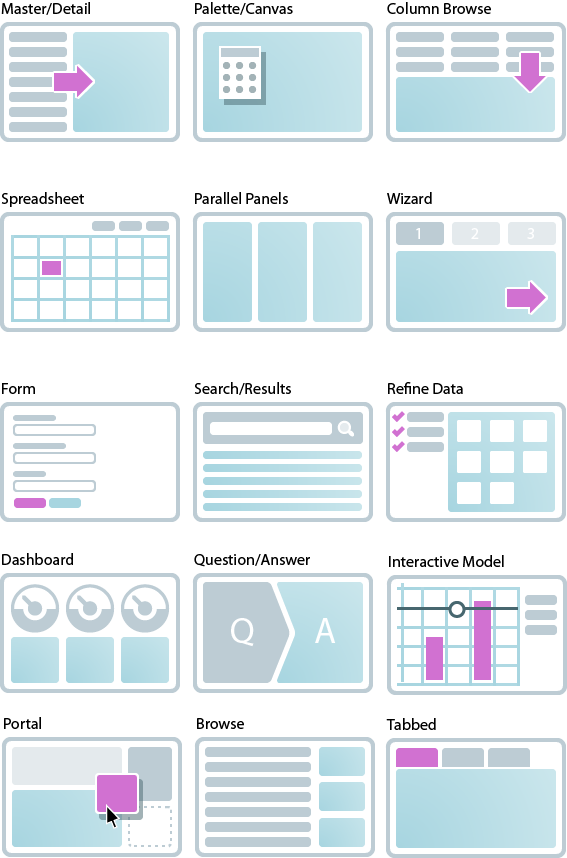
What are UI Design patterns? Peter explains during his UI Design pattern lecture that design patterns are a general, reusable solution to a commonly occurring “problem” within a given context.
UI Design patterns, according to ui-patterns.com, are recurring solutions that solve common design problems. Design patterns are standard reference points for the experienced user interface designer.
Design patterns provide a common language between designers. They allow for debate over alternatives. They often include a problem, like what the user wants to do; a context, like when the pattern should be used; and a solution. Finally, It is not a finished design that can be transformed directly into source or machine code, it’s something to be observed.
Generally, there are 3 kinds of design patterns (mockplus.com), including structural, creational and behavioral patterns. Though in different forms, the 3 basic patterns share some characteristics in common, and the key design points of them lie in, such as the color match, utilization of space, compatibility with different screen sizes, adopting progressive presentation, and so on.
Now let’s begin by identifying patterns at work on the Weather Live mobile app
The application has common navigational (ui-patterns.com) design patterns, within Contents, the app utilizes Favorites, within Data and search, we have the Autocomplete, and within Gestures, the application accommodates Pull-to-refresh.
With favorites, the app allows users to curate a personalized list of favorite items, in this case, favorite “Places” where you can easily locate cities with weather conditions you pay attention to. Favorites can help users create sense in overwhelming sets of data, in this case, it’s convenient to have a list of favorited cities and their weather conditions to avoid having to search through an overwhelming amount of data/city names every time the app is opened.
With the autocomplete function, it provides recognition aided search when users are performing search tasks. In this case, the system generates a list of city/town names that matches the set of letters you have inputted. The Autocomplete pattern allows faster input, reduces the number of keystrokes needed, prevents typing errors, and provides feedback on the validity of what is being entered. The cognitive burden of remembering an exact text-phrase is made easier, as the user can use the autocomplete pattern to only type in details that he or she remembers.
We use refresh to update any updatable content, in this case, it’s the weather data retrieved from a weather API that is updated every other minute. The gesture pull-to-refresh is commonly used on touch screens to avoid creating a refresh button that takes up space, the refresh button is commonly used in browsers like Google Chrome.
Material Design patterns (material.io)
Icons-
An icon in a user interface can be defined as an image which has a high symbolic value and is used for the purpose of communication (tubikstudio.com). Icons present signs which are informative, sometimes omitting the need for words and sentences. System icons symbolize common actions, files, devices, and directories. System icons are designed to be simple, modern, friendly, and sometimes quirky. Each icon is reduced to its minimal form, expressing essential characteristics. They should have a symmetrical and consistent look, ensuring readability and clarity, even at small sizes.
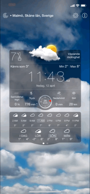
On the top of the Weather Live app main display, you see three icons, to the left, it’s a familiar icon that resembles the radar, to the right, two icons represent settings and information, settings icons are usually represented with a cog or some sort of gear, users are familiar with that so it’s pretty straight to the point [Fun Fact: Traditionally the operation of a mechanical tool was determined by the physical constraint of the position/type/size of the gears used. So if you wanted to change a tool setting, you would have to manually make an alteration to the gear(s). Therefore, using a gear for settings is a metaphor that has made its way into our visual language lexicon. (stackexchange.com)] The information icon is also familiar with the iconic “i”. Throughout the app the designers have used other icons such as a thermometer to represent temperature, rain droplets to signal likeliness of rain, and umbrella symbol that represents the amount of precipitation, and so on. In this current layout I’m using, all of these icons include a small text underneath, as the icons are not completely intuitive and clear enough for comprehension. For example, you could mix up the rain droplets and umbrella symbol as they could mean one or the other, that’s why text is used. Of course, this varies between whichever layout you select, but this is the one I am redesigning for.
Users’ understanding of an icon is based on previous experience. That’s why it’s better to use familiar icons rather than unique. It’s important to rely on universal icons. For the reconstruct, I will most likely be omitting the location text as a button and replacing with a “list” icon instead that lists out the locations you have saved, this is also an icon that people recognize from previous experience. As you can see, the iOS weather app uses this icon to pull up the saved locations and weather conditions as well.
Color theory / system-
A harmonious color system or color theme is often carefully selected and designed to suit the general mood and cohesiveness of any application. Colors have great impact on people’s mood and behavior. That’s why the success of the product depends largely upon the colors chosen for the design. The color harmony is about the arrangement of the colors in design in the most attractive and effective way for users’ perception. When colors are organized, viewers feel pleased and calm, while disharmony in design gives the feeling of chaos and disgust. The color balance is vital in design since users make their impression of the website or application by the first look, and colors have the big influence.
On Weather Live, a darker theme is used the background, the background is not static and instead an animation is played that reflects the current weather condition in your location or whichever location you have chosen. The colors range from cooler to warmer tones but they’re always more contrasted and dark to compliment the white text in the foreground. Between the text and the background, there are translucent blocks so that the white text does not get lost amidst that moving background and is easier to read. To create contrast between UI elements, such as distinguishing text from background, you can use light or dark variants of your primary color on each elements, in this case, white is used over the dark and grey-ish background.
Other patterns
Typography in UI design and addressing the Selected Typeface-
People are used to receiving the majority of information in text form (though this has been less used with the introduction of icons) and designers need to make this process easy and productive. Font size, width, color, and text structure all matters. Designers can transfer certain mood or message by choosing appropriate fonts and the ways of their presentation. This way typography helps design to communicate with people. Visual performance and readability of copy in digital products have the great impact on user experience. If fonts are badly legible, people can face problems with navigation or even worse.
Font family used on Weather Live: Helvetica Neue
Backstory: “The Helvetica® design is a classic that has stood the test of time – and changed with technological advances in the process. First announced in 1957, Helvetica was re-released in 1983 as the Neue Helvetica® family, with a suite of subtle differences that made a positive impact on the design.” (Fonts.com) Helvetica Neue is a reworking of the typeface with a more structurally unified set of heights and widths. The font family is made up of 51 fonts including nine weights in three widths (8 in normal weight, 9 in condensed, and 8 in extended width variants). Helvetica Neue also comes in variants for Central European and Cyrillic text.
iOS and macOS uses Helvetica Neue as its system font, this makes me believe that Weather Live on iOS also uses this font because of its simple design and easy readability, but also, since the system already adopts the same font anyways, the user’s would gain familiarity to the app quicker. But this is just my personal speculation. Since Apple’s intention was to provide a consistent experience for people who use both iOS and macOS, maybe the Weather Live developers wanted to stay consistent with the system as well.
As I’ve mentioned, my subjective opinion tells me that this was an appropriate choice of typeface because it’s easily readable, properly spaced out (even the denser weights), and also because of users’ familiarity with the typeface. The font choice never stood out as being strange or difficult to read since I first tried the application out, so I would consider it successful.
Use of Motion and Spatial Logic-
Motion in the world of design is used to describe spatial relationships, functionality, and intention with beauty and fluidity (icons8.com). Motion redefines navigation and creates a more natural experience by adding a new level of depth to Interaction design. Motion design makes interfaces spatially logical. State changes in UI often involve hard cuts by default, which can make them difficult to follow. Users need to understand where things come from and where they can find them again so that it doesn’t feel hard-cut. Motion design fills the comprehension gap by defining the spatial relationships between screens and elements.
Motions can draw user’s attention to a specific area — or help to distract from it. Good motion design makes UI more predictable and easier to navigate. The main challenge with motion is making it something that doesn’t distract users from the thing they’re trying to do. Weather Live does not utilize too many navigational tools, so motion design isn’t used too much during transitions other than the sliding transitions, and those are pretty subtle and natural, which is perhaps the aim for motion here. However, the background is an animated image of the current weather condition utilized appropriately in order to not distract users while bringing the point across. One aspect of the app where the developers could enhance motion design in their app is perhaps creating a less static search page instead of the current one that resembles almost all traditional search pages.
According to stormotion.io, there are design tips recommended for building a weather application:
Say more with fewer words. Don’t overwhelm the screen with all the info that you have. The main screen should include only essentials — everything other should be distributed between other screens. (Check! Weather Live uses replaces chunks of text with some icons and shortened texts to ease the user’s eyes.)
Make it move. People love apps that look interactive and a bit entertaining. If it’s raining behind the window — make it rain on the screen, too. (Check! Weather Live doesn’t have a boring an static background, instead it varies based on the weather condition in your current location.)
Weather Live adopts characteristics that most weather apps do, with an emphasis on the temperature, forecast, and a glimpse of the current weather condition outdoors. When you open the main frame, the first thing you may notice is the time, displayed at the center of the main frame, then the temperature on the top left of the center component, and finally the little diagram center top of the central component. In my opinion, there’s no issue with these components and where the information is placed, as the app automatically retrieves weather data from your current location.
As you may see in the screenshot to the left, when you take a look at the main display, the first thing you may notice is the complex display, I say “complex” without a negative connotation, it’s a beautifully designed display and I have no complaints regarding that.
The app affords scrolling ↑ ↓ → ←
Upon opening the app, you may already notice that the main interface affords the act of scrolling in all different directions– ↑ ↓ → ←, when you scroll left or right, you are presented with the other cities and their weather conditions, these are the cities that you’ve previously looked up and have added in your list of places. When you scroll upwards, you refresh the page and the information gets updated, when you scroll down, more weather information in your current location is provided.
After searching for the page for adding cities and new weather information by scrolling, I then noticed the little symbols towards the top of the page. Those of course, stood out as buttons to me, but none of the symbols called out “adding a new location” to me. But because I didn’t find the page I was looking for, I pressed through the buttons to find the page anyway.
The left most symbol resembled a radar logo, opening it up, it is the rain map, which you can also customize in your settings for what you would like to display– either clouds, satellite, or the simple rain map that I have at the moment. This animated weather radar helps you quickly see what weather is coming your way. This is straightforward and easy to access for those who like to look at weather this way. The buttons to the top right corner, both very common logos– “settings”, and “information”, are straightforward as well, I thought I would be able to find adding a new location in the settings tab as that was where you got to customize your display, but I couldn’t find it there. And the information button only advertises apps from the same developers.
After pressing around the main frame, including the weather information panels because they’re the same color as the buttons in the top panel, I find out/ remember that to get to the page of adding new weather in a new city, you have to click on the text of the city’s name itself. This is completely hidden in affordance because like I said earlier on, the actual weather information is also white and has the exact same font as the text for the location, I could barely tell that that’s what I was supposed to press.
There is a tiny downward-point arrow to the left of the location text but that didn’t trigger anything in my mind, I only understood that after finding out that was where I had to press.
After pressing the location text, you’re taken to a page that appears as a list of cities titled “Places” and their temperatures. You’re also provided a small symbol on the left of every city or town name that represents the weather condition. This page is much easier to understand but should be easier to have access to.
I confirmed this as an issue by letting some fellow peers try out the app on their own without guidance (most people were not familiar with using the app and usually use and are satisfied with the preinstalled iOS Weather app), I didn’t tell them what function I had a problem with, but I noticed, based on observing how they interact with the app, that they never thought of or get close to pressing the location text tab to change the location, they do tap the buttons with symbols and also try tapping around in the pretty display underneath instead. Then when I revealed my main focus, their reactions were mostly “Oh, I didn’t even notice that”, “It didn’t look like a button”, “The text is too small compared to Weather iOS app” and so on.
In addition to how difficult finding this specific “Places” page was, when you tap the addition symbol top left corner of the “places” page, it takes you to a search window where you can search the city of your liking. Once you’ve typed in the city and taken back to the original “Places” page, there’s no “return to previous page” button for you to return to the main display, what you have to do is press on the location again to see the weather details. This is also hard to determine intuitively and I was only able to understand this through trial and error. What I aim to “reconstruct” in the redesign is to make the “Places” page easier to find, as well as small adjustments on the page itself. In the next journal entry I will be analyzing the app’s UI design patterns.
Below is a deconstruction of the app which is a representation of the app with annotations of patterns and functions.
The kick-off of this course begins with an introduction to our first project— De/Re-construct. Furthering our knowledge during the recent GUI course, this project aims to help us analyze and “deconstruct” an existing GUI, identifying design patterns of the interface, then create and test a modest redesign by “reconstructing” and using alternative patterns.
Starting with process of deconstruction, I began from investigating the apps on my phone, searching around to see if there are applications with specific functions that are confusing, difficult to register intuitively, or simply poorly designed. That being said, phone apps nowadays have gone through plenty of iterations and update that most apps are nearly perfect functionality-wise other than the occasional bugs. I definitely had a hard time finding an app that I had major issues with. I thought of apps that are present for one sole function— but take multiple clicks until you get to the point, such as the Notes app on Apple iOS, where you start with a “map” page, which guides you to another page when you select “notes” (this was split this way after the integration of iCloud), and then finally the note-taking icon pops up for you to take notes— which was probably your sole reason for starting up Notes-app. School applications such as KronoX— where many use for checking the time and location of your upcoming lecture, is problematic and takes way too many clicks to get to your schedule in addition to the poorly-designed main page interface.
In the end, I settled with the app called Weather Live. Weather Live is a slightly more “advanced” weather app compared to the pre-installed iOS”Weather” app on iPhone and other Apple’s devices. It is a beautifully designed app with real-time weather condition background images. It offers relatively detailed data for daily, hourly, and 7-day forecasts, but what makes this app stand out is the highly customizable display. You can choose from four different layouts, each providing simple or complex details. You can also set which data is displayed in which order for each layout. So, if you live somewhere with a lot of rainfall, you may want the precipitation parameter on top. If you like to watch the sunset, put that time higher up in your layout. Plus, every morning, you’ll get a daily report notification with the current condition and its relativity to yesterday’s weather.
These are some screenshots of the app’s main GUI, as you can see, you can personalize your main page and choose between four different display layouts, all of which displays real-time weather conditions in the background.
The main issue I’m having as I use this app is that as the main GUI is opened up- I always end up having a hard time finding and accessing the page where you can see the weather conditions in other cities and adding/removing new cities and their weather in your saved places. The app makes it simple to look through the few cities’ weather conditions that you’ve already saved in your display— by scrolling left and right, however, that could be troublesome when you would like to quickly access— for example— Sydney, Australia, not being sure that you have it saved, you would have to scroll through your list first, and when you discover that you don’t have the city saved, you would have to add it in your saved list of cities, which, in my opinion, is difficult to find and pull up.
As a student living in a city but studying in another, having friends and family on all over the world, traveling at least twice in half a year, and having a hometown in a different continent on the other side of the globe, I try to access the page where you can add/remove cities, quickly check weather conditions of the place you’re traveling to in two days, taking a look at the conditions in your hometown you know is being hit by a tropical rainstorm, etcetera. Take a look at how I interact with the app— keep in mind that this is simply a reenactment of my usual interaction with the app when I make the mistake of not knowing/remembering how to pull up the “Places” page, therefore, it’s not a genuine interaction.
I will break the app down further in terms of what specific issues I’m experimenting with finding the “Places” page in the next journal entry, you can read it here.


 Journal with me!