
An analysis of UI design patterns on the Weather Live mobile application
What are UI Design patterns? Peter explains during his UI Design pattern lecture that design patterns are a general, reusable solution to a commonly occurring “problem” within a given context.
UI Design patterns, according to ui-patterns.com, are recurring solutions that solve common design problems. Design patterns are standard reference points for the experienced user interface designer.
Design patterns provide a common language between designers. They allow for debate over alternatives. They often include a problem, like what the user wants to do; a context, like when the pattern should be used; and a solution. Finally, It is not a finished design that can be transformed directly into source or machine code, it’s something to be observed.
Generally, there are 3 kinds of design patterns (mockplus.com), including structural, creational and behavioral patterns. Though in different forms, the 3 basic patterns share some characteristics in common, and the key design points of them lie in, such as the color match, utilization of space, compatibility with different screen sizes, adopting progressive presentation, and so on.
Now let’s begin by identifying patterns at work on the Weather Live mobile app
The application has common navigational (ui-patterns.com) design patterns, within Contents, the app utilizes Favorites, within Data and search, we have the Autocomplete, and within Gestures, the application accommodates Pull-to-refresh.

With favorites, the app allows users to curate a personalized list of favorite items, in this case, favorite “Places” where you can easily locate cities with weather conditions you pay attention to. Favorites can help users create sense in overwhelming sets of data, in this case, it’s convenient to have a list of favorited cities and their weather conditions to avoid having to search through an overwhelming amount of data/city names every time the app is opened.

With the autocomplete function, it provides recognition aided search when users are performing search tasks. In this case, the system generates a list of city/town names that matches the set of letters you have inputted. The Autocomplete pattern allows faster input, reduces the number of keystrokes needed, prevents typing errors, and provides feedback on the validity of what is being entered. The cognitive burden of remembering an exact text-phrase is made easier, as the user can use the autocomplete pattern to only type in details that he or she remembers.
We use refresh to update any updatable content, in this case, it’s the weather data retrieved from a weather API that is updated every other minute. The gesture pull-to-refresh is commonly used on touch screens to avoid creating a refresh button that takes up space, the refresh button is commonly used in browsers like Google Chrome.
Material Design patterns (material.io)
Icons-
An icon in a user interface can be defined as an image which has a high symbolic value and is used for the purpose of communication (tubikstudio.com). Icons present signs which are informative, sometimes omitting the need for words and sentences. System icons symbolize common actions, files, devices, and directories. System icons are designed to be simple, modern, friendly, and sometimes quirky. Each icon is reduced to its minimal form, expressing essential characteristics. They should have a symmetrical and consistent look, ensuring readability and clarity, even at small sizes.


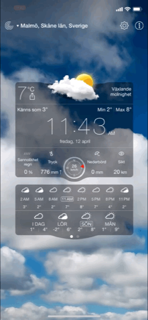
On the top of the Weather Live app main display, you see three icons, to the left, it’s a familiar icon that resembles the radar, to the right, two icons represent settings and information, settings icons are usually represented with a cog or some sort of gear, users are familiar with that so it’s pretty straight to the point [Fun Fact: Traditionally the operation of a mechanical tool was determined by the physical constraint of the position/type/size of the gears used. So if you wanted to change a tool setting, you would have to manually make an alteration to the gear(s). Therefore, using a gear for settings is a metaphor that has made its way into our visual language lexicon. (stackexchange.com)] The information icon is also familiar with the iconic “i”. Throughout the app the designers have used other icons such as a thermometer to represent temperature, rain droplets to signal likeliness of rain, and umbrella symbol that represents the amount of precipitation, and so on. In this current layout I’m using, all of these icons include a small text underneath, as the icons are not completely intuitive and clear enough for comprehension. For example, you could mix up the rain droplets and umbrella symbol as they could mean one or the other, that’s why text is used. Of course, this varies between whichever layout you select, but this is the one I am redesigning for.

Users’ understanding of an icon is based on previous experience. That’s why it’s better to use familiar icons rather than unique. It’s important to rely on universal icons. For the reconstruct, I will most likely be omitting the location text as a button and replacing with a “list” icon instead that lists out the locations you have saved, this is also an icon that people recognize from previous experience. As you can see, the iOS weather app uses this icon to pull up the saved locations and weather conditions as well.
Color theory / system-

A harmonious color system or color theme is often carefully selected and designed to suit the general mood and cohesiveness of any application. Colors have great impact on people’s mood and behavior. That’s why the success of the product depends largely upon the colors chosen for the design. The color harmony is about the arrangement of the colors in design in the most attractive and effective way for users’ perception. When colors are organized, viewers feel pleased and calm, while disharmony in design gives the feeling of chaos and disgust. The color balance is vital in design since users make their impression of the website or application by the first look, and colors have the big influence.

On Weather Live, a darker theme is used the background, the background is not static and instead an animation is played that reflects the current weather condition in your location or whichever location you have chosen. The colors range from cooler to warmer tones but they’re always more contrasted and dark to compliment the white text in the foreground. Between the text and the background, there are translucent blocks so that the white text does not get lost amidst that moving background and is easier to read. To create contrast between UI elements, such as distinguishing text from background, you can use light or dark variants of your primary color on each elements, in this case, white is used over the dark and grey-ish background.
Other patterns
Typography in UI design and addressing the Selected Typeface-
People are used to receiving the majority of information in text form (though this has been less used with the introduction of icons) and designers need to make this process easy and productive. Font size, width, color, and text structure all matters. Designers can transfer certain mood or message by choosing appropriate fonts and the ways of their presentation. This way typography helps design to communicate with people. Visual performance and readability of copy in digital products have the great impact on user experience. If fonts are badly legible, people can face problems with navigation or even worse.
Font family used on Weather Live: Helvetica Neue

Backstory: “The Helvetica® design is a classic that has stood the test of time – and changed with technological advances in the process. First announced in 1957, Helvetica was re-released in 1983 as the Neue Helvetica® family, with a suite of subtle differences that made a positive impact on the design.” (Fonts.com) Helvetica Neue is a reworking of the typeface with a more structurally unified set of heights and widths. The font family is made up of 51 fonts including nine weights in three widths (8 in normal weight, 9 in condensed, and 8 in extended width variants). Helvetica Neue also comes in variants for Central European and Cyrillic text.
iOS and macOS uses Helvetica Neue as its system font, this makes me believe that Weather Live on iOS also uses this font because of its simple design and easy readability, but also, since the system already adopts the same font anyways, the user’s would gain familiarity to the app quicker. But this is just my personal speculation. Since Apple’s intention was to provide a consistent experience for people who use both iOS and macOS, maybe the Weather Live developers wanted to stay consistent with the system as well.
As I’ve mentioned, my subjective opinion tells me that this was an appropriate choice of typeface because it’s easily readable, properly spaced out (even the denser weights), and also because of users’ familiarity with the typeface. The font choice never stood out as being strange or difficult to read since I first tried the application out, so I would consider it successful.
Use of Motion and Spatial Logic-
Motion in the world of design is used to describe spatial relationships, functionality, and intention with beauty and fluidity (icons8.com). Motion redefines navigation and creates a more natural experience by adding a new level of depth to Interaction design. Motion design makes interfaces spatially logical. State changes in UI often involve hard cuts by default, which can make them difficult to follow. Users need to understand where things come from and where they can find them again so that it doesn’t feel hard-cut. Motion design fills the comprehension gap by defining the spatial relationships between screens and elements.
Motions can draw user’s attention to a specific area — or help to distract from it. Good motion design makes UI more predictable and easier to navigate. The main challenge with motion is making it something that doesn’t distract users from the thing they’re trying to do. Weather Live does not utilize too many navigational tools, so motion design isn’t used too much during transitions other than the sliding transitions, and those are pretty subtle and natural, which is perhaps the aim for motion here. However, the background is an animated image of the current weather condition utilized appropriately in order to not distract users while bringing the point across. One aspect of the app where the developers could enhance motion design in their app is perhaps creating a less static search page instead of the current one that resembles almost all traditional search pages.
According to stormotion.io, there are design tips recommended for building a weather application:
- Say more with fewer words. Don’t overwhelm the screen with all the info that you have. The main screen should include only essentials — everything other should be distributed between other screens. (Check! Weather Live uses replaces chunks of text with some icons and shortened texts to ease the user’s eyes.)
- Make it move. People love apps that look interactive and a bit entertaining. If it’s raining behind the window — make it rain on the screen, too. (Check! Weather Live doesn’t have a boring an static background, instead it varies based on the weather condition in your current location.)
Weather Live adopts characteristics that most weather apps do, with an emphasis on the temperature, forecast, and a glimpse of the current weather condition outdoors. When you open the main frame, the first thing you may notice is the time, displayed at the center of the main frame, then the temperature on the top left of the center component, and finally the little diagram center top of the central component. In my opinion, there’s no issue with these components and where the information is placed, as the app automatically retrieves weather data from your current location.


 Journal with me!